Overview
How do athletes interact with fitness trackers during team sports? We created a survey on fitness tracker usage and the reasons behind their use in team sports. If a participant had never used a tracker before, we asked why and whether they would buy one if specific changes were made. We received 15 responses that revealed key findings about gaps in the current market.
Research
We surveyed 15 UW participants with a 10 minute survey split into two sets of questions. The first set was for people who had used a fitness tracker before. It asked what team sports they play while using one, how often they check it during events, what they monitor, and why they chose their tracker over other options. The second set was for those who had never used a tracker and explored their reasons for not owning one.
53.3% of participants had never used a fitness tracker before. Among those who did own one, trackers were used less often during team sports than individual exercise. Most users said that features were the biggest factor in deciding whether to buy a tracker.
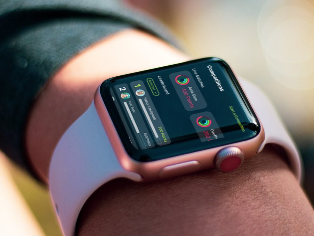
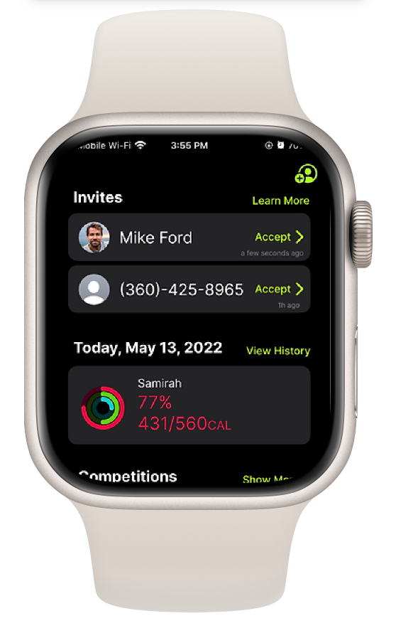
We noticed a lack of collaboration and sharing features across existing fitness trackers. This led us to redesign the experience by adding features where users can invite others to compete or support each other through outdoor activities and sports.
Usability Research
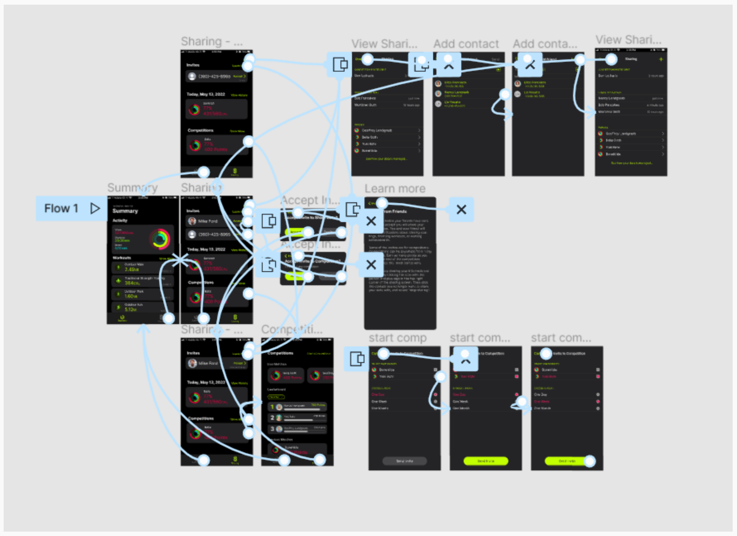
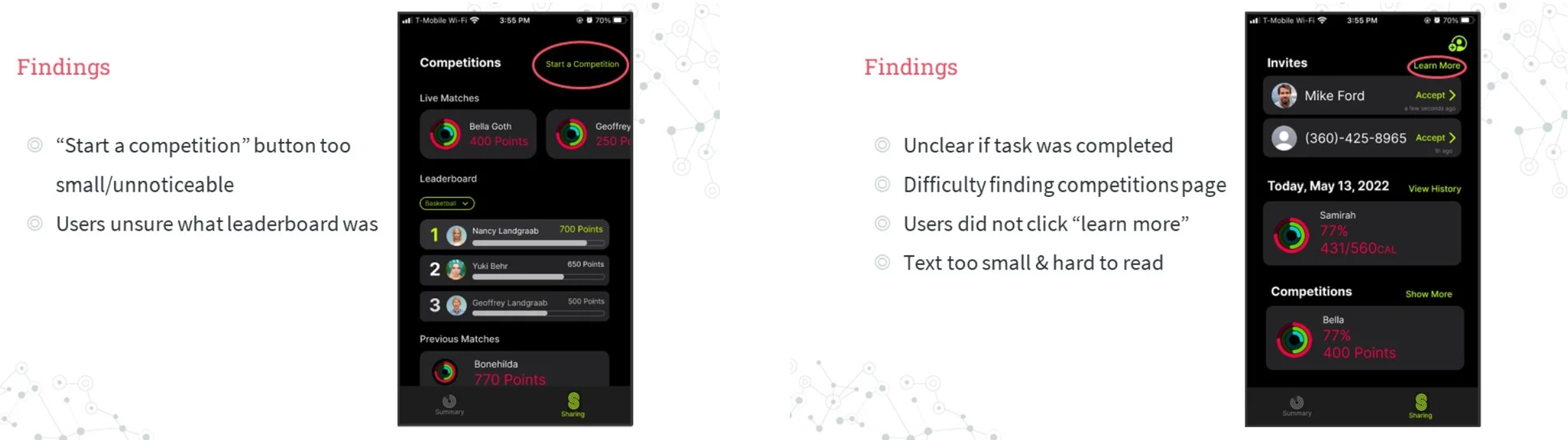
We used Figma to create a mockup of our new interface and conducted a usability study with 4 participants. Each participant was asked to complete three tasks that test the updated parts of the interface. Some users had trouble understanding certain vocabulary, and others struggled to find where specific features were located.
Task 1
What issues do users encounter while trying to create a competition in the app?
Task 2
What issues do users encounter while trying to share data with a friend?
Task 3
What issues do users encounter while finding ways to improve or track team progress?
Final Prototype
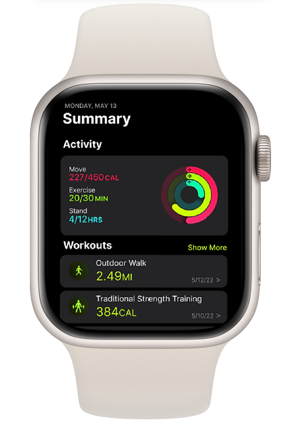
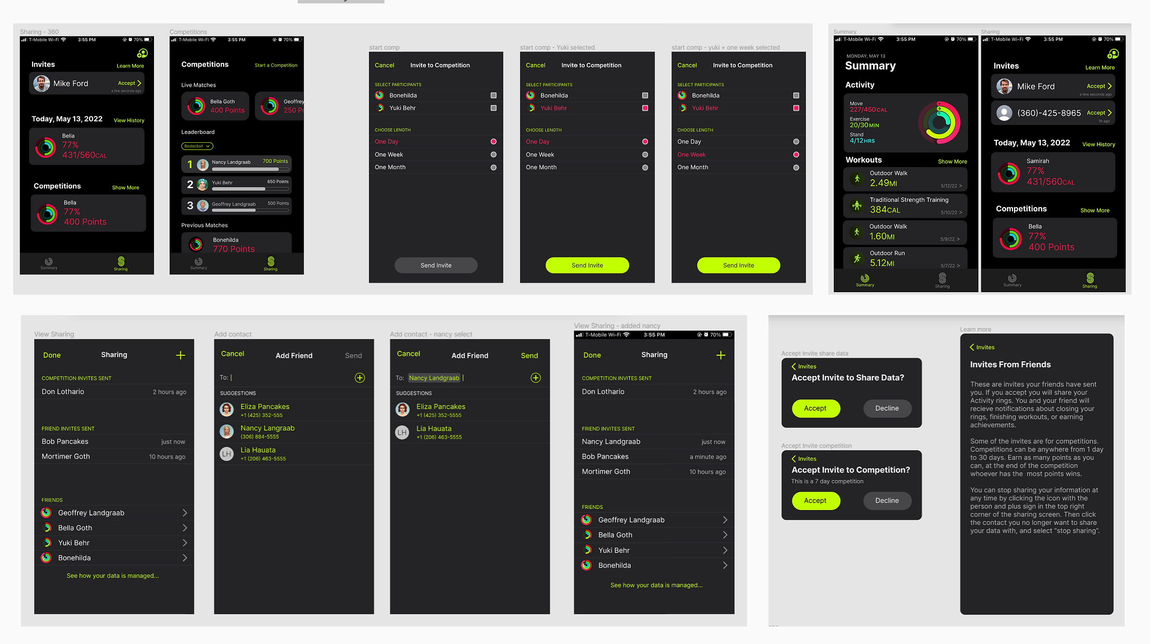
My team and I built the prototype in Figma and focused on showing interactions to invite, accept, decline, collaborate, or compete. Instead of creating a new fitness watch, we adapted the tracker into an iPhone app. We wanted the app to feel similar to Apple's style, so we used vibrant neon colors over a dark background with round buttons and card layouts.
Conclusion
This project made me realize how people actually navigate the prototype. Something that I was really surprised about was how most of the participants never looked near the top of the phone and their eyes always went to the center of the screen. While I personally liked the black background, my participant actually didn't like the black background and found the neon colors distracting.
I also observed from my participant that they like to interact through chat systems instead of clicking buttons to invite someone. Overall, this was a great experience in figuring out user needs and how designs might affect users.