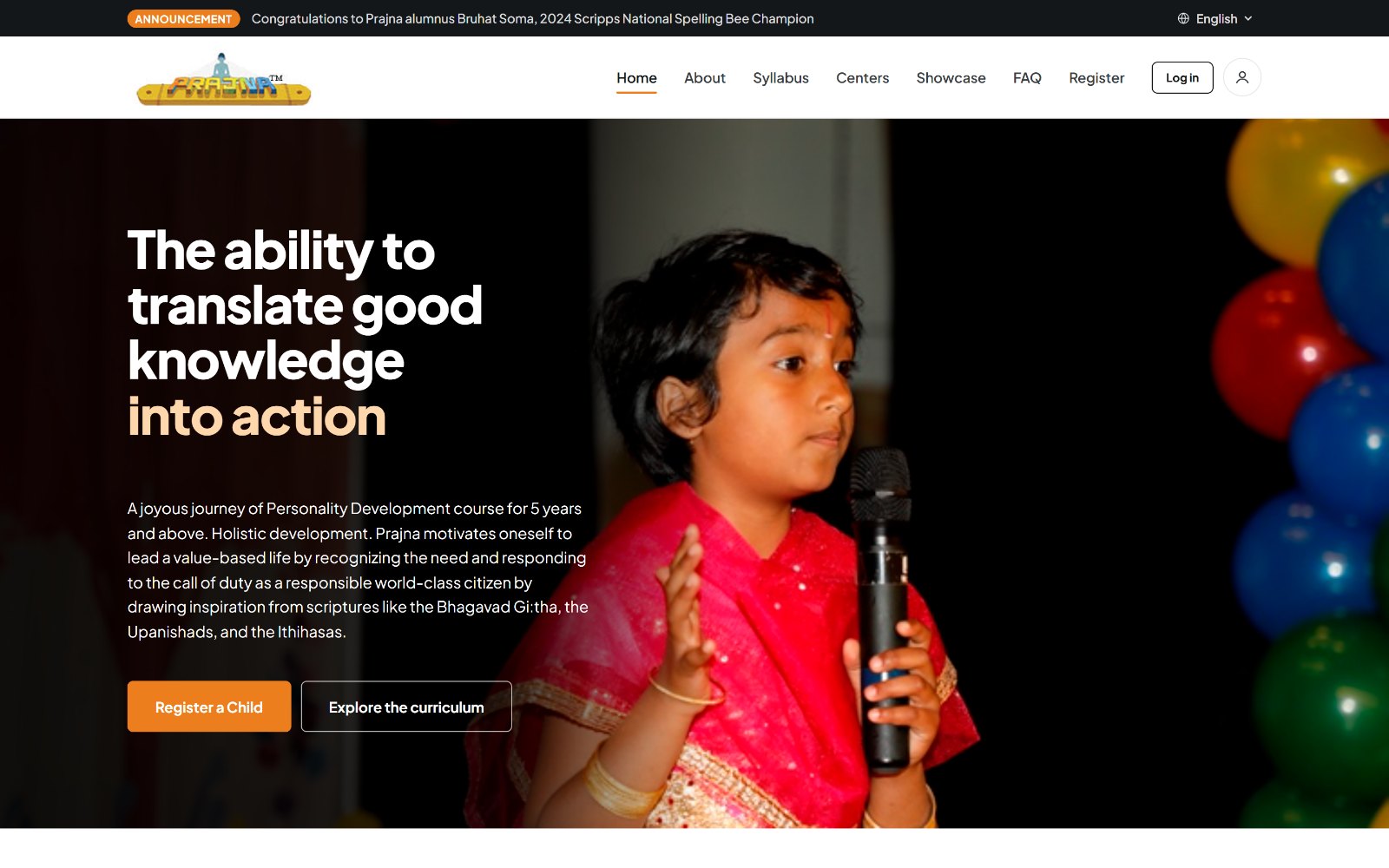
Overview
Prajna teaches Vedic culture, values, and public speaking to children through weekend classes run entirely by volunteers. Families find it by word of mouth, then land on a website that was built to hold the program's paperwork rather than to welcome them.
Challenge
A parent could not answer three basic questions from the site: what is this, is there one near me, and how do I sign my child up. Everything was flattened onto one long page and buried in a menu built around the organization's internal structure.
Approach
I ran comprehension checks and card sorting with parents, teachers, and people new to the program, rebuilt the navigation around what visitors were actually trying to do, and designed and built the whole site as a working React prototype.
Outcome
A live, accepted redesign covering seventeen pages, including a searchable center finder, a browsable syllabus, a student showcase, and three protected forms. It was delivered as a pre-compiled build the organization's developers can drop straight in.
The Site I Started With
The original site was not broken. It was organized for the people who ran the program, not for the people arriving at it for the first time.
Almost everything lived on the homepage. The opening paragraph defined Prajna in a single 60-word sentence. Below it, the same content was repeated three times side by side, once each for parents, teachers, and coordinators, with the "what can you do" and "registration process" lists for all three roles shown to every visitor at once. The Syllabus menu opened into fourteen items grouped by internal track names. Locate, the page that answers "is there one near me," was a link most parents never noticed.
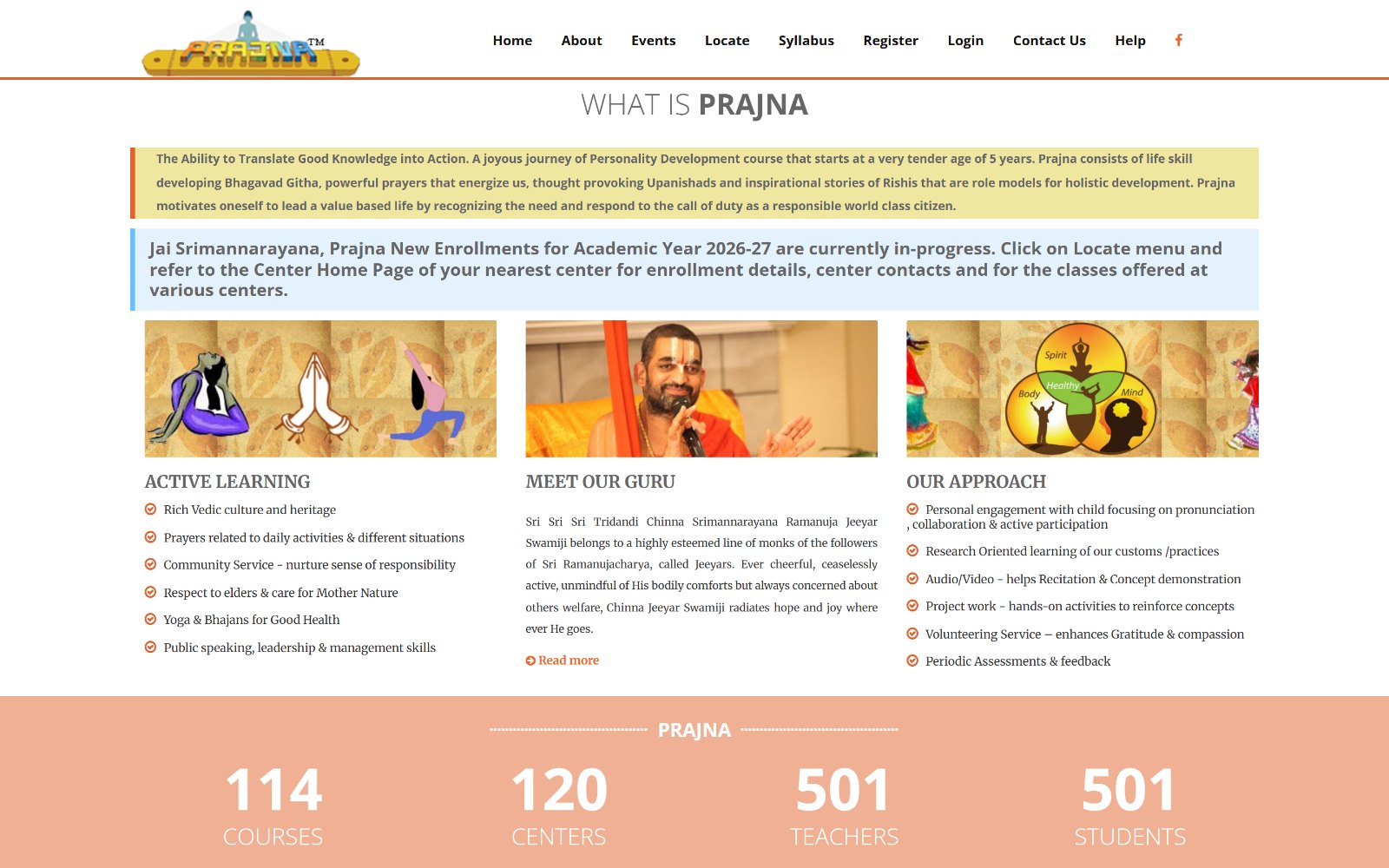
Before, the top of the original homepage
What I flagged in the audit
- No answer to "what is this." The definition was accurate but written for people who already knew the program.
- Navigation built on internal structure. Track 1, Track 2, and Sisu Module mean something to a coordinator and nothing to a new parent.
- Role content shown all at once. Parents read three sets of instructions to find the one that applied to them.
- Finding a center was hidden. "Locate" sat between About and Syllabus with no weight and no map.
- Nothing showed the children. A program about kids speaking, reciting, and performing had almost no evidence of it.
- No real mobile experience, despite most parents arriving from a phone link shared in a community group.
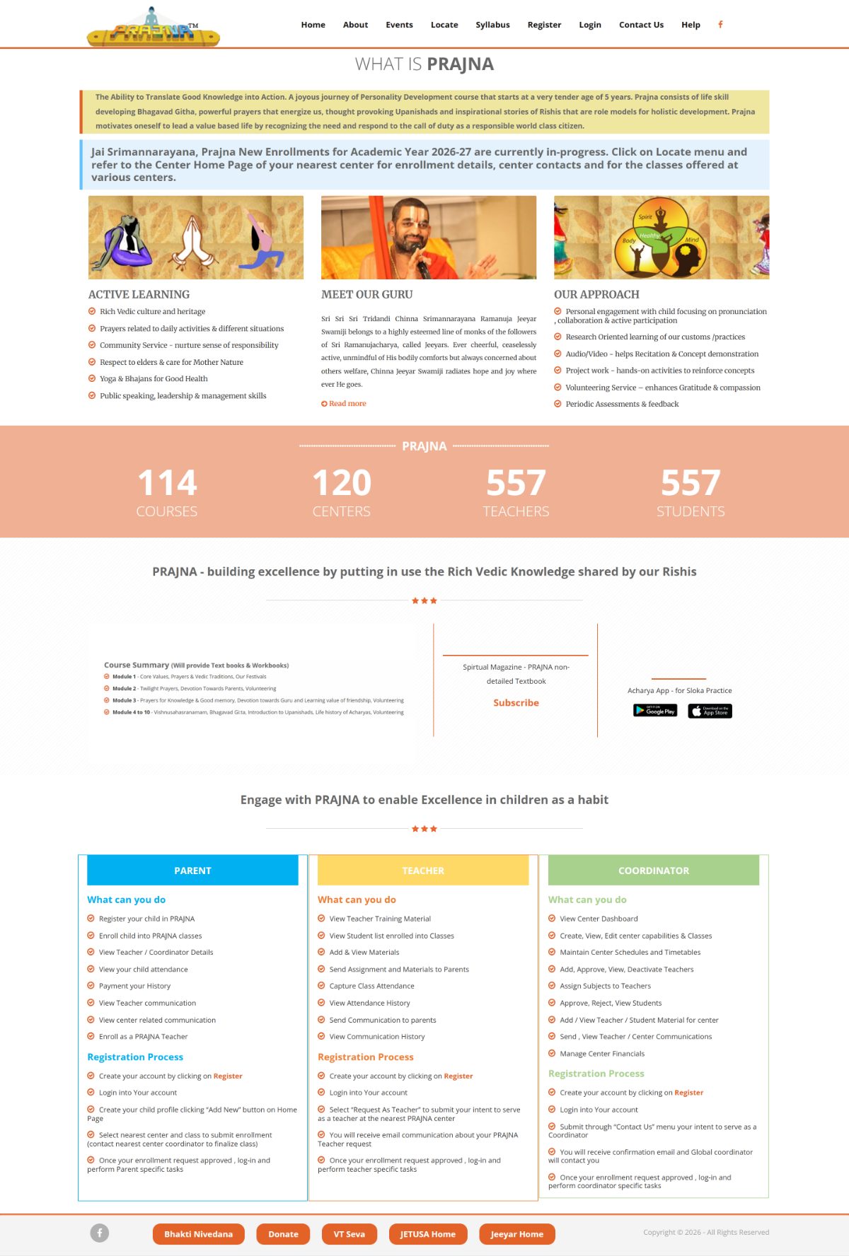
Before, the whole page. Nearly the entire site lived here
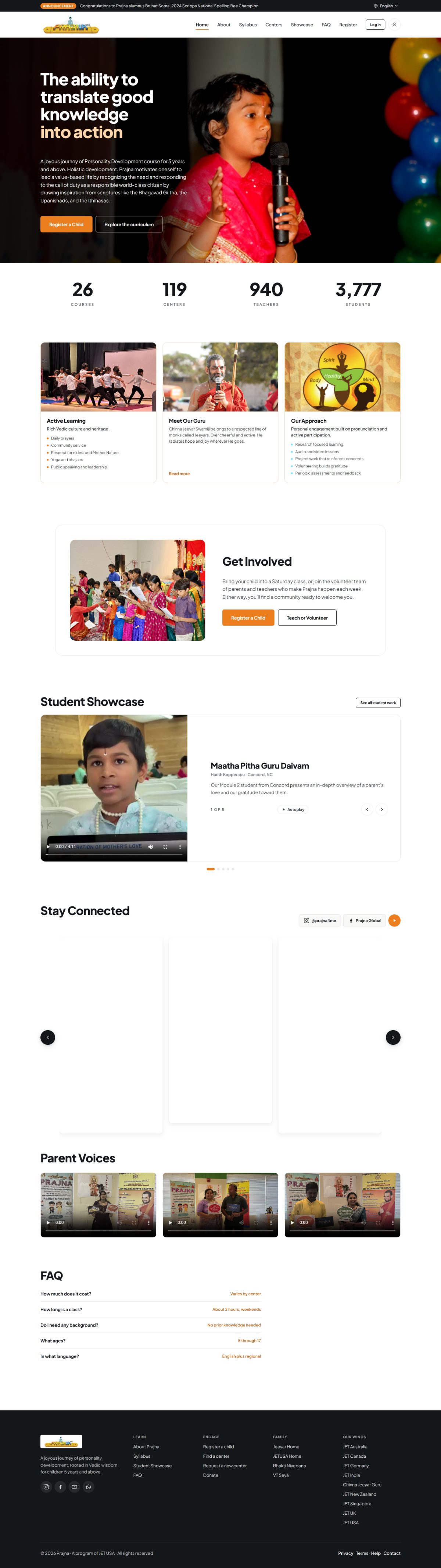
After, the whole page. Each section does one job
Goals
- Answer the first three questions fast. What Prajna is, whether there is a center nearby, and how to enroll, all reachable from the homepage.
- Rebuild navigation around visitor tasks rather than the organization's internal track structure.
- Separate the audiences. Give parents a path that does not make them read teacher and coordinator instructions.
- Show the program, don't just describe it. Put students, parents, and classes on the page.
- Make it usable for every parent, including those who are more comfortable reading in a language other than English.
Research
I ran an informal study with three groups: parents, teachers who run classes, and people with no connection to the program at all. The outsider group mattered most, because they mirror a parent following a link from a community chat with no context.
Comprehension check
I showed people the existing site and asked them to tell me, in their own words, what Prajna is and who it is for. Participants outside the community consistently could not. They picked up "children" and "Vedic," but could not describe what actually happens in a class, what a child does week to week, or what the program leads to. The information was all present. It was written in the organization's vocabulary rather than a parent's.
Card sorting
I then had participants sort the site's pages under the navigation labels, and asked which pages could be merged or dropped entirely. Three patterns came out of it:
- Nobody placed the module pages under their internal track names. People sorted by "what my kid learns," not by Foundation, Track 1, or Track 2.
- Locate, Events, and center contact details were repeatedly grouped into one thing. Participants expected a single place that answered "where and when."
- The three role columns were sorted apart every time. No participant kept parent, teacher, and coordinator content together.
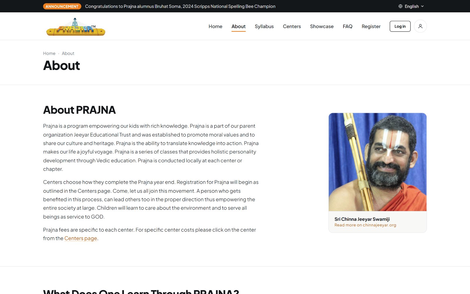
After, the program described in a parent's vocabulary
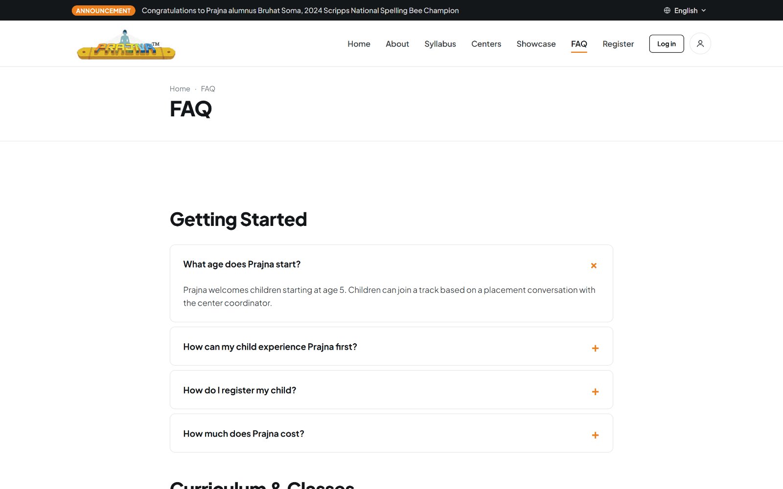
The questions people actually asked, answered directly
What the Card Sort Changed
The navigation was rebuilt to match how people sorted, not how the program is administered.
- Syllabus. Fourteen menu items collapsed into one page with track tabs and a module rail. The internal track names stayed, but as a second layer instead of the entry point.
- Centers. Locate, Events, and scattered contact details merged into a single searchable finder with a map and per-center profile pages.
- Showcase. A new page, added because the strongest evidence for the program was student work nobody could see.
- FAQ. Also new. Cost, class length, ages, prior knowledge, and language, pulled out of body copy into direct answers.
- Register. Given its own page with a walkthrough video and a plain "after registering" checklist, instead of a bullet list buried in a column.
- Role content. Split apart. Parents get registration, teachers and coordinators get their own routes, and no visitor reads instructions meant for someone else.
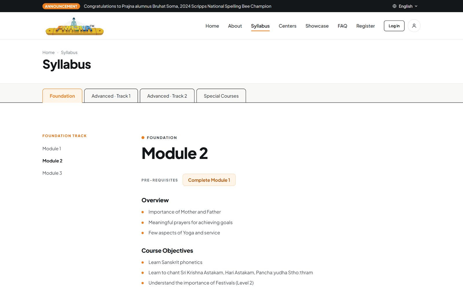
Syllabus, one page with tabs instead of a fourteen-item menu
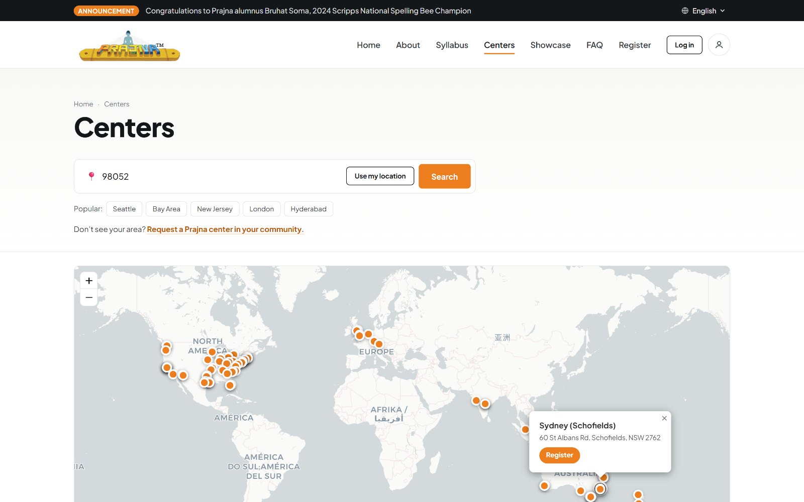
Centers, search by ZIP, by location, or straight off the map
Designing for Parents
The decision-maker here is a parent, often a first-generation immigrant parent, frequently reading on a phone, sometimes more comfortable in a language other than English. Every major choice came back to that person.
- A language toggle in the utility bar, so a parent who reads more comfortably in Telugu, Hindi, or another language is not shut out of enrolling their child.
- Plain-language rewrites throughout. The hero says what the program is in one readable line, with the long-form philosophy moved to About.
- Two CTAs, not ten. "Register a Child" and "Explore the curriculum" carry the homepage, and "Register a Child" stays pinned on mobile.
- Real photographs of classes, meets, and community events instead of clip art, so a parent can see what a Saturday actually looks like.
- Accessible defaults, including strong text contrast, visible focus states, real form labels, semantic headings, and keyboard-reachable controls.
Building Trust Into the Details
Two areas needed more than a visual pass, because they are where a hesitant parent either commits or leaves.
Registration
Registration opens with a walkthrough video, then a tabbed log in and create account panel with an "after registering" checklist beside it, so a parent knows what happens next before they type anything. All three forms on the site are protected with a silent CAPTCHA, a hidden honeypot field, a submission timing check, and an email confirmation round trip, which matters for an organization run by volunteers with no one on duty to clear out spam.
The center finder
Centers are the moment of truth. A parent searches by ZIP code, uses their device location, taps a popular metro, or explores the world map directly. Each pin opens a center profile with its address, contact, and a register link. If nothing is nearby, the page offers the one useful alternative instead of a dead end: request a Prajna center in your community.
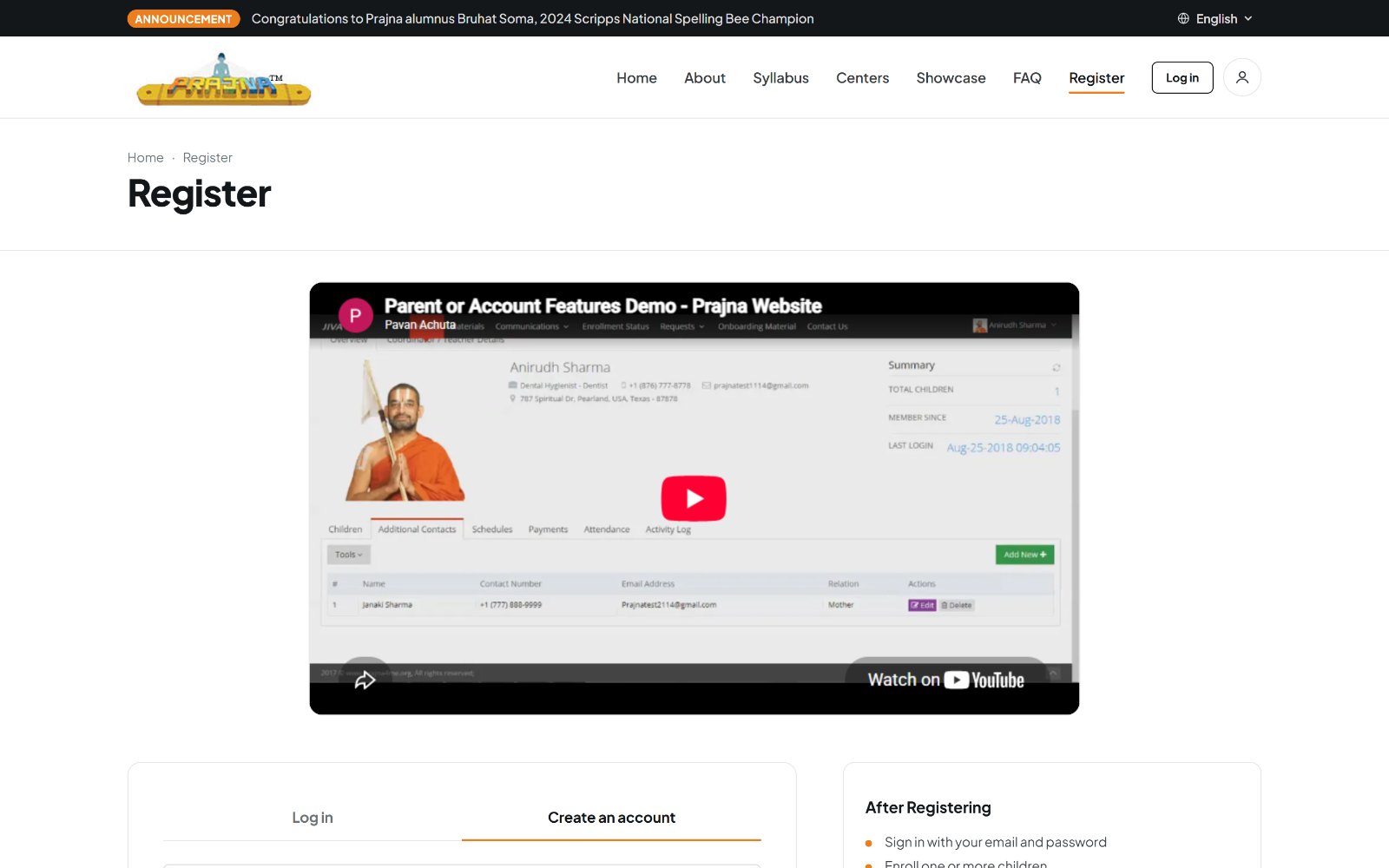
Register, with a walkthrough before the form
Usability Testing
I tested the finished site with parents and with teachers who run classes, giving them tasks rather than a tour.
- Register a child for classes. Participants found the path from the homepage without prompting, and the walkthrough video answered questions before they reached the form.
- Find a specific module. The track tabs held up. People browsed to a module and read its objectives without needing the internal track vocabulary explained to them.
- Find a center near you. Search and the map both worked as entry points, and participants used whichever matched how they think about location.
- Explain what this site is for. The comprehension question that people failed on the original site, repeated at the end of the session. This time participants could describe the program and who it serves.
Teachers reviewed the site separately and gave input on how the syllabus and center content read to someone who teaches from it. I checked the accessibility work in the same sessions, including whether the language option was findable by a parent who needed it.
Build and Handoff
I designed this in code rather than in a static design file. It started as a single-page low-fidelity sketch and grew into a full React prototype covering seventeen pages, which meant every design decision was tested in a real browser, at real breakpoints, with real content.
For handoff, I compiled the prototype into plain HTML, CSS, and JavaScript with no build step, no bundler, and no JSX, so the organization's developers can drop it into their existing stack without adopting new tooling. It ships with documentation covering the component structure, the design token layer, the hardcoded data arrays that need to be wired to their database, and every stub that needs a backend.
The code was written with an AI collaborator. The research, information architecture, content strategy, visual design, and every product decision are mine. Directing a build to a shipped, documented, handoff-ready result is a skill I lean into deliberately.
What This Project Shows
- Research to structure. Turned card sorting and comprehension findings directly into a navigation model, and can show the line from one to the other.
- Content strategy. Rewrote an organization's own vocabulary into language a first-time parent understands, without losing what it means.
- Inclusive design. Designed for multilingual, mobile-first, non-technical users as the default case rather than an edge case.
- Design to delivery. Took a redesign from audit through research to a documented, production-ready build a client team can actually integrate.
Reflection
What I Learned
- Testing with people outside the community was the highest-value hour of the project. Insiders could not see what was missing because they already knew it.
- A card sort settles navigation arguments faster than any amount of opinion, including my own.
- Designing directly in the browser caught responsive and content-length problems that a static mockup would have hidden until build.
- For a volunteer-run organization, handoff quality is part of the design. Work that cannot be maintained does not ship.
What's Next
- Wiring the center finder and syllabus to live data instead of the hardcoded arrays in the prototype
- A coordinator-facing view, so the volunteers running centers get the same care the parent flow got
- Professional translation of key pages, rather than relying on a browser translation widget