Overview
Voyager is a self-directed project: a browser-based 3D solar system that turns real astronomical data into a calm, explorable experience. It is built for two audiences at once — someone who just looked up at the night sky and wondered, and someone who works in the space industry.
Challenge
Space coverage tends to be either oversimplified or buried in jargon. There was no quiet, beautiful place to actually get to know the worlds we already know — at a depth each visitor chooses.
Approach
An interactive 3D solar system grounded in real orbital data, with a layered information architecture: wonder and plain-language facts on the surface, mission history and technical detail one click deeper.
Outcome
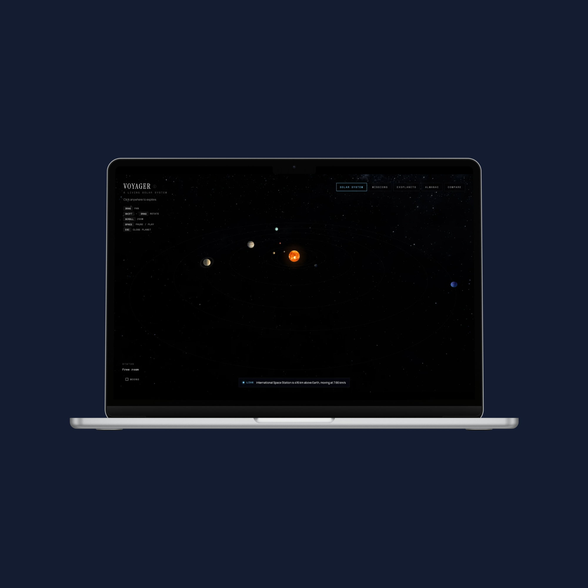
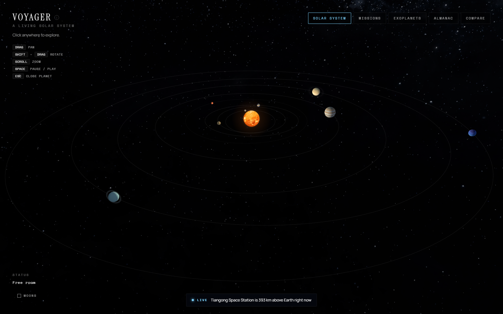
A live, shipped product — a cinematic, explorable solar system with planets, moons, exoplanets, mission trajectories, and a reference almanac, running in any browser.
Why I Built This
The world is moving fast — people talk about Mars like it's somewhere we might actually go. My brother wants to be a robotics engineer in the space industry, and watching his curiosity made me want to build something worthy of it.
I wanted a quiet place to look at the worlds we already know, learn what's strange and beautiful about each one, and see how much real science has already been done. Not a textbook. Not a game. A real solar system, presented honestly — built with high-school readers in mind, but designed for anyone who looks up and wants to know more.
Designing for Two Audiences
The hardest design problem in Voyager wasn't the 3D — it was serving two very different visitors with one interface.
A curious newcomer wants wonder and plain answers: what is this planet like, could anything live there. A space-industry visitor wants depth: which missions went there, what they found, the engineering, the conditions.
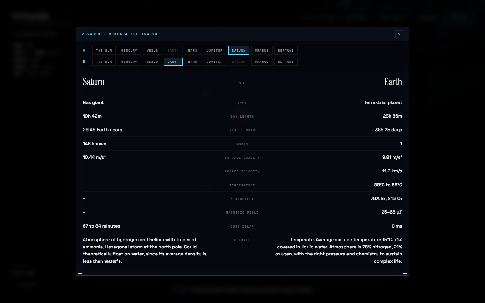
The solution was layered disclosure. Every planet opens to a basic-facts layer — climate, habitability, a plain-language "could humans live here." One click deeper, a full-screen Visit logbook holds the mission history, discoveries, engineering notes, and condition modes for atmosphere, water, magnetic field, and interior. The casual visitor never has to see the depth; the professional never has to dig for it. Same interface, different reading depths.
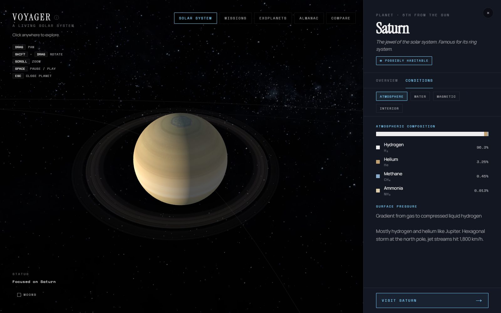
Surface layer — plain-language facts and condition modes
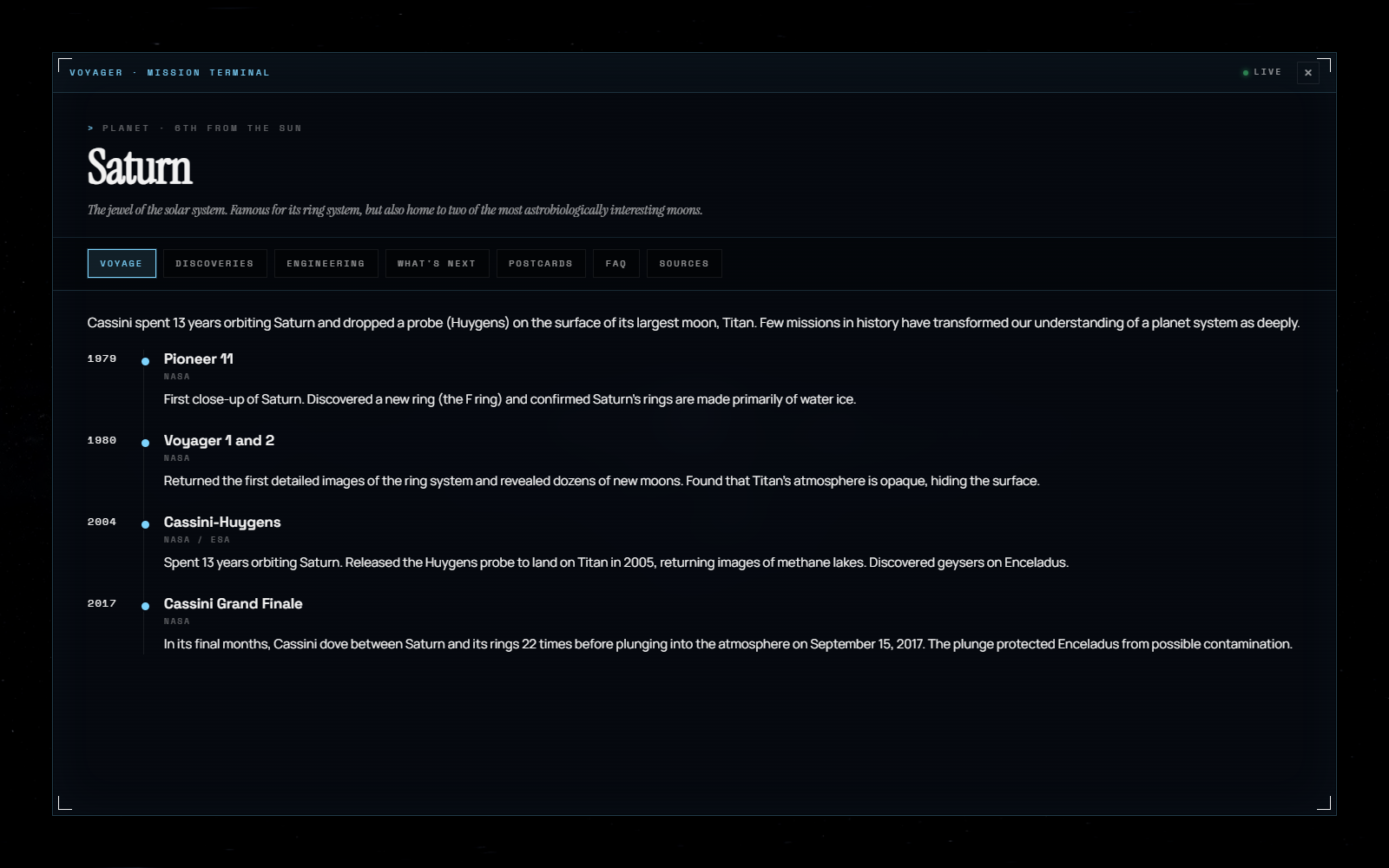
Depth layer — a full-screen mission logbook per world
How It Came Together
Voyager grew in layers. Each phase shipped a working experience before the next one began — so the project always had a real, usable core rather than a pile of half-finished features.
1 · The Solar System
A 3D scene with eight planets and the Sun, on real elliptical orbits computed from Kepler's laws.
2 · Going Deeper
Moons, and condition modes that recolour each planet by atmosphere, water, magnetic field, or interior.
3 · Visit Logbooks
Full-screen per-planet dossiers — mission timelines, discoveries, postcards, and FAQs.
4 · Widening Out
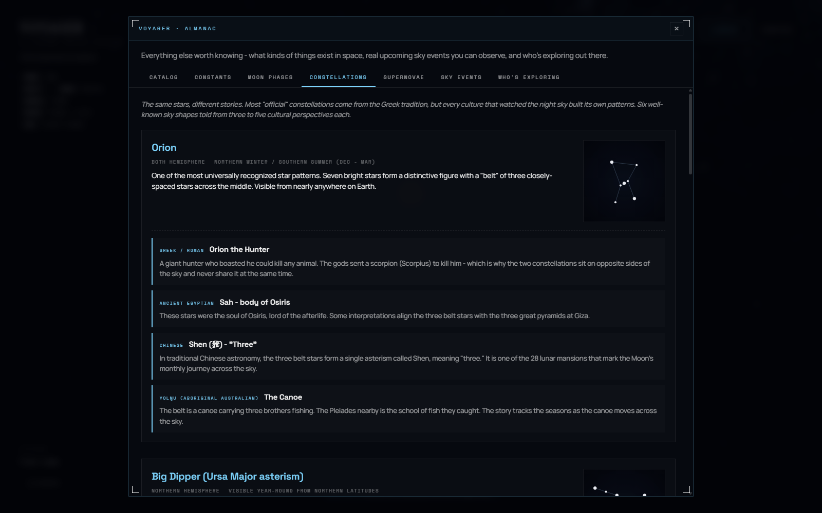
An exoplanet starmap, real mission trajectories, and an Almanac of sky events, moon phases, and constellations.
5 · Mobile
A full responsive pass so the experience holds up on a phone, not just a desktop.
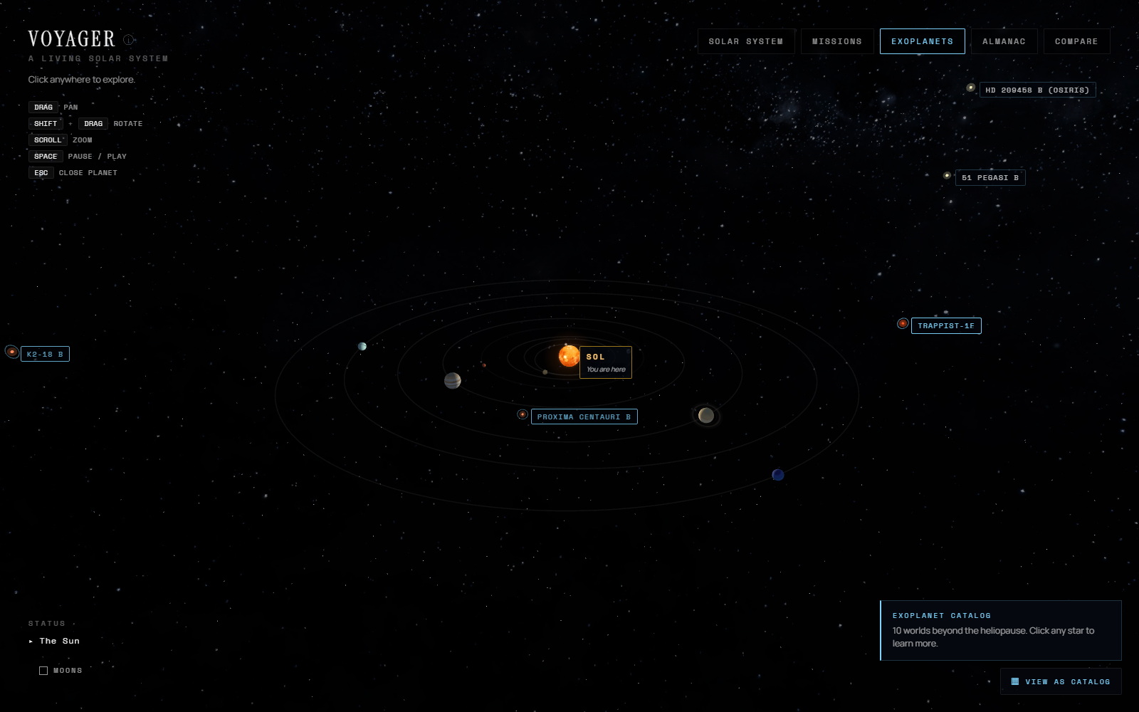
Exoplanet starmap
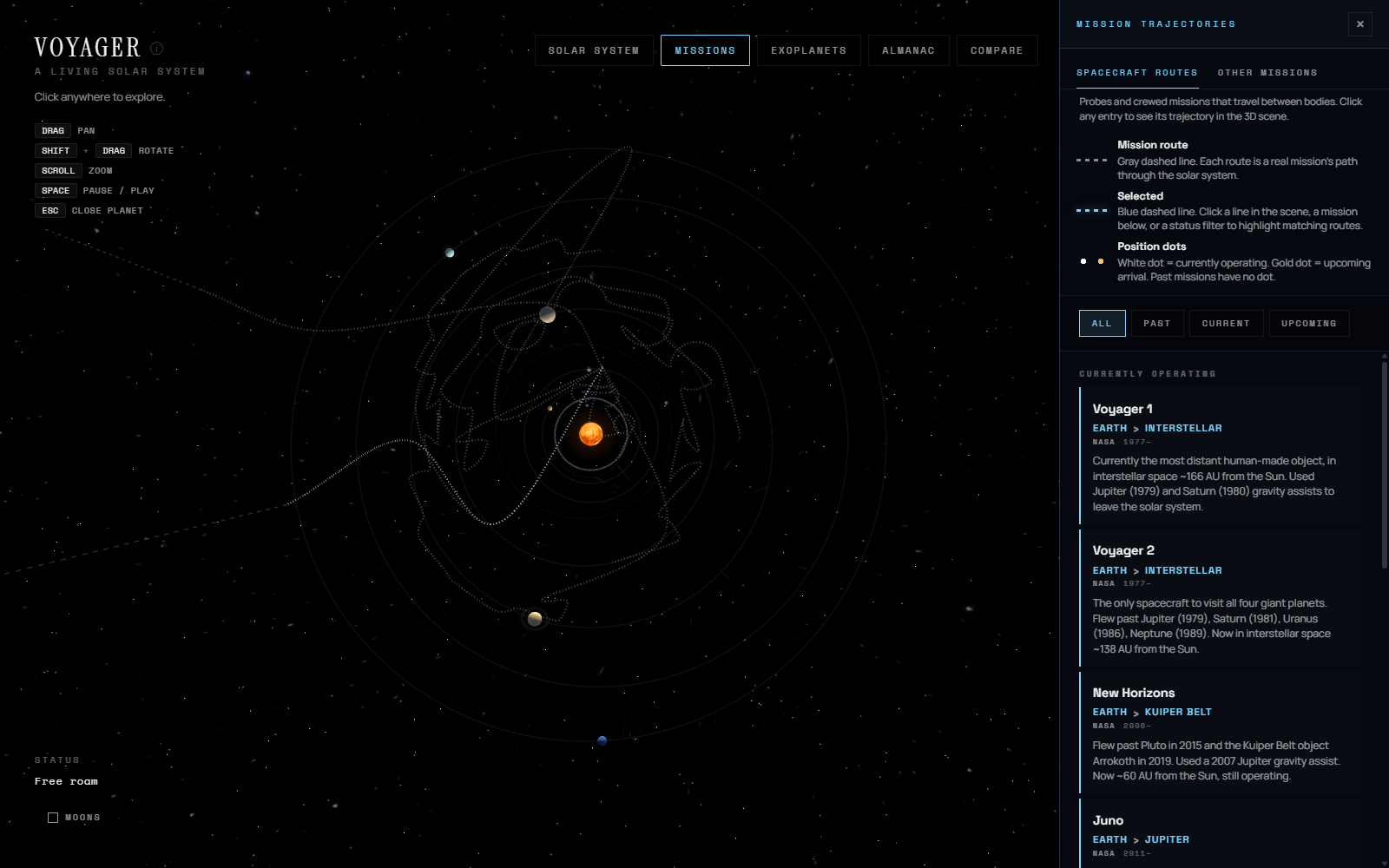
Real mission trajectories
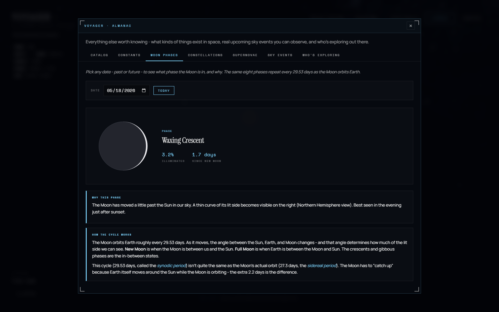
Almanac — moon phase for any date
Under the Hood
Voyager is a plain HTML, CSS, and JavaScript site with no build step, using Three.js for the 3D scene. Orbits are computed from real J2000 ephemerides and Kepler's laws; the ISS and Tiangong are tracked live from NORAD position data; moon phases use a standard astronomical algorithm. It is deployed on Vercel.
The code was written with an AI collaborator (Claude). The concept, design, information architecture, visual direction, and content are mine — I directed the build the way a designer directs any production team, making the calls on structure, behaviour, and detail. Translating a clear design vision into a shipped product by directing an AI is a skill in itself, and one I lean into deliberately.