Overview
Whimsy Walks is a community project that encourages people to explore Seattle neighborhoods on foot. The goal is to improve the walking experience through custom routes, shared culture, and public art. I worked as a prototyper, analyst, and brand designer over three months to research, design, and deliver a website for this project. Visit the live site at whimsywalks.org.
Original Website
Screenshots of the existing Whimsy Walks website before the redesign. Reviewing the original helped identify usability issues and areas for improvement.
The Process
Gregory, the project administrator, shared his vision for Whimsy Walks and what he wanted to achieve:
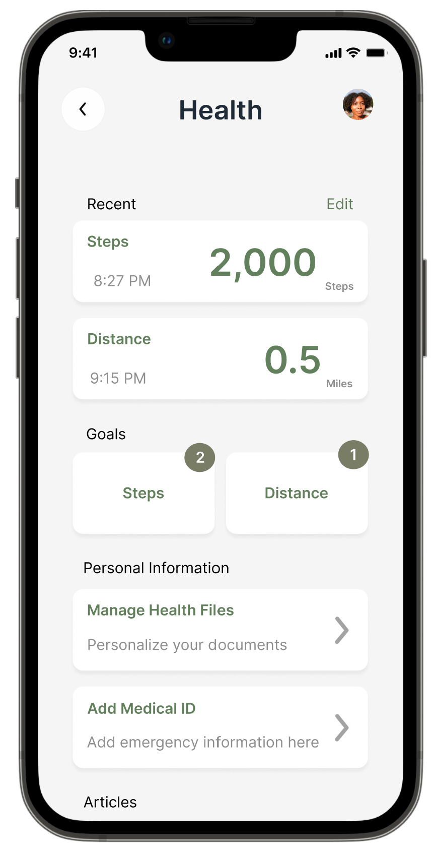
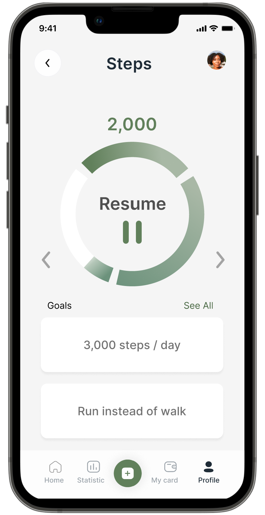
- Inactivity can lead to serious illnesses, so the app should encourage people to get moving.
- Improve the explorer's experience when walking through route customization.
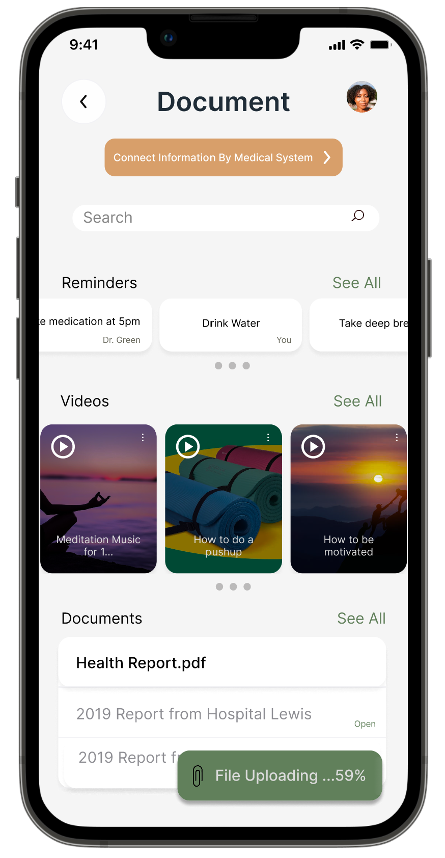
- Provide a space where administrators can view community feedback and bring people together.
- Since it is a new project, spread awareness and collaborate with different communities to share their culture and art along walking routes.
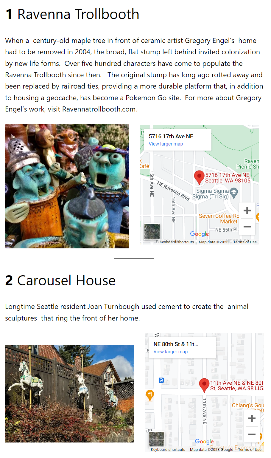
Current Whimsy Walks sites include Ravenna, U-District, Roosevelt, Maple Leaf, and Green Lake, with a goal to expand into more neighborhoods over time.
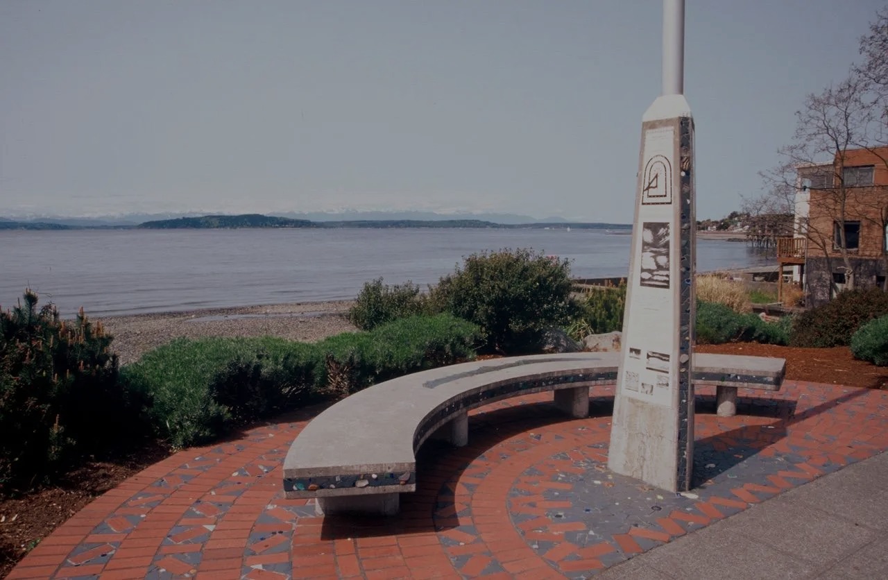
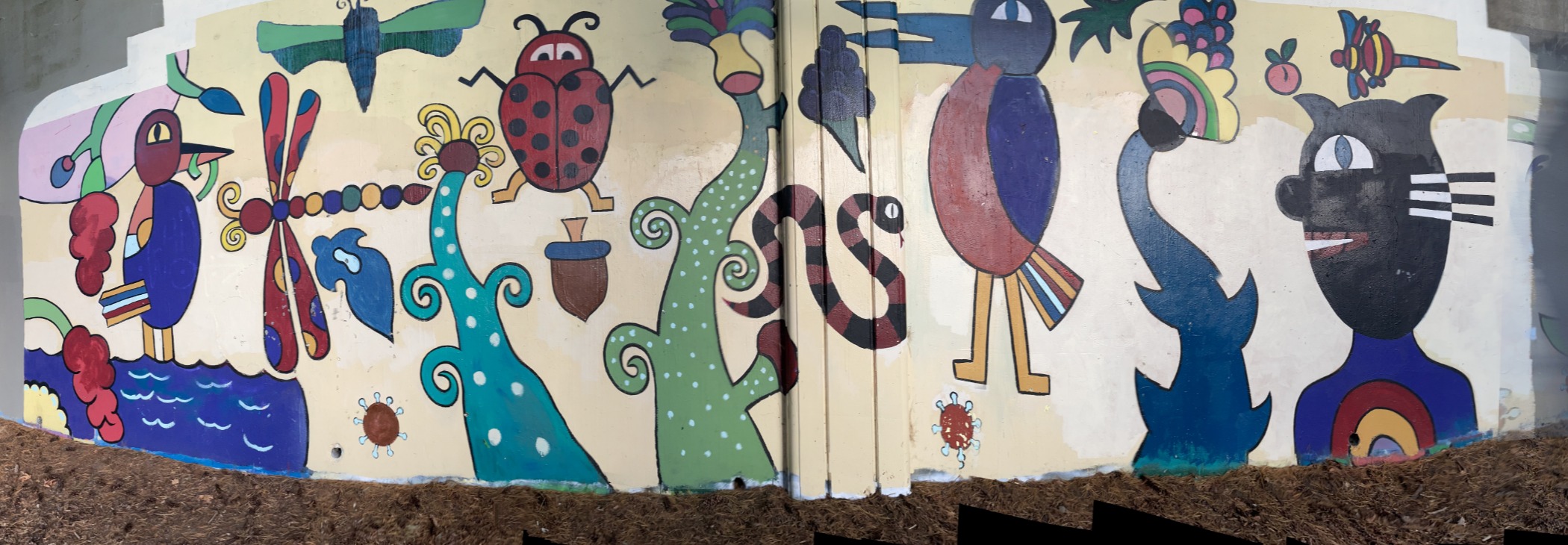
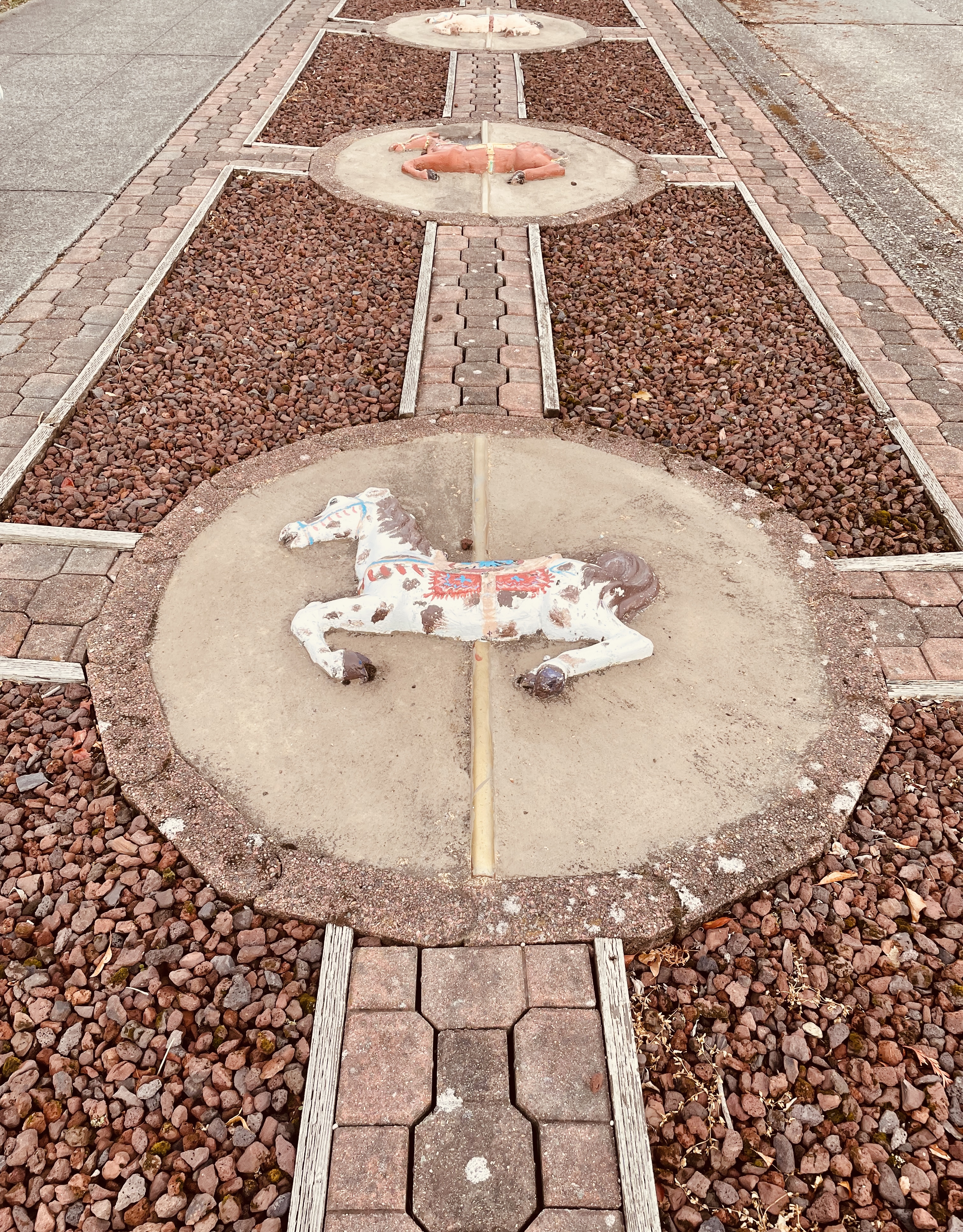
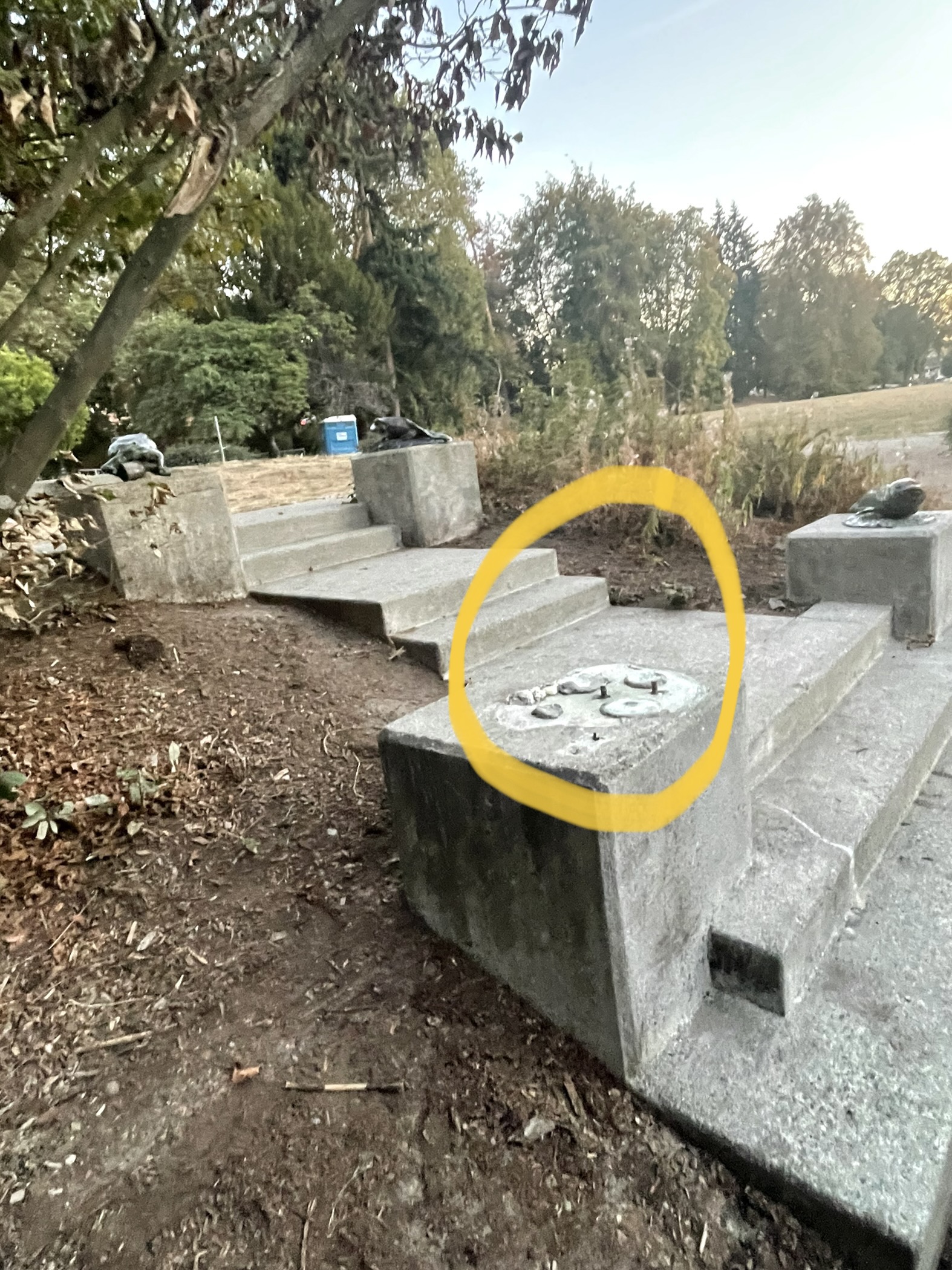
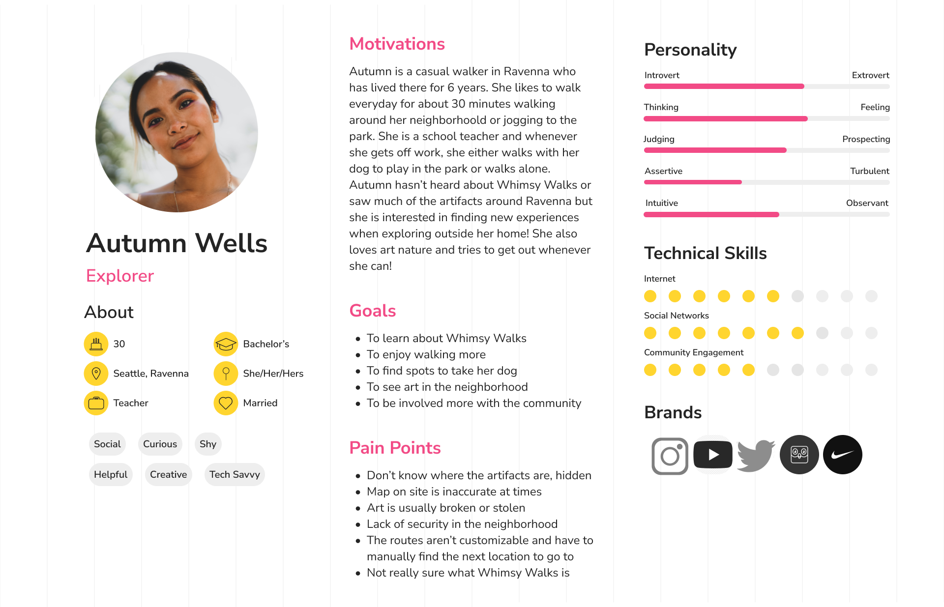
Field Study
We went to different art sites in Ravenna to observe any factors that might affect an explorer's walking route. This helped us understand how the physical environment shapes the walking experience and what information explorers need before and during a walk.
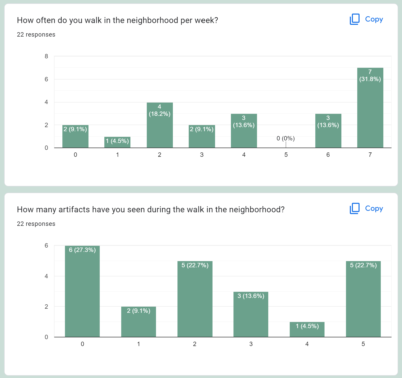
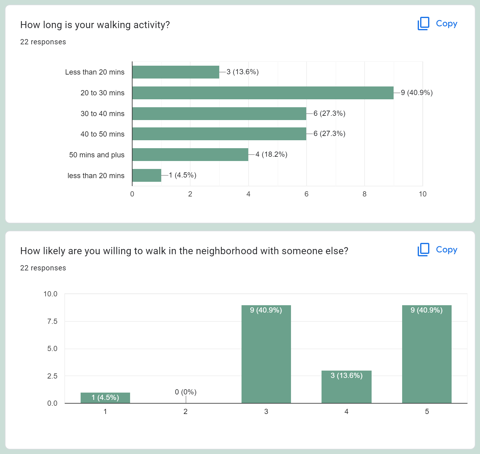
Survey at Ravenna Park
We collected 22 survey responses at Ravenna Park. The survey helped us understand what walkers value most and what barriers prevent them from exploring new routes.
We also conducted an interview with Gregory Engel to align the design direction with the project's goals.
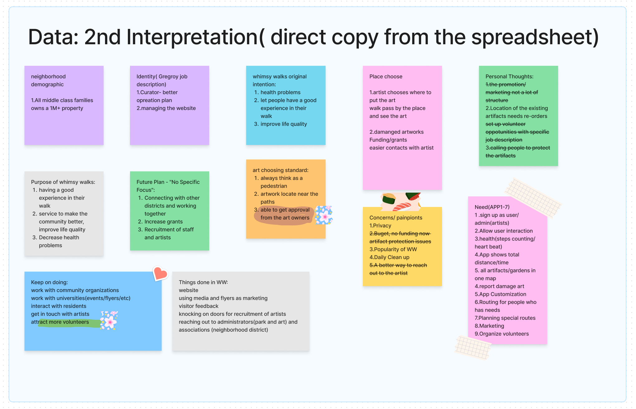
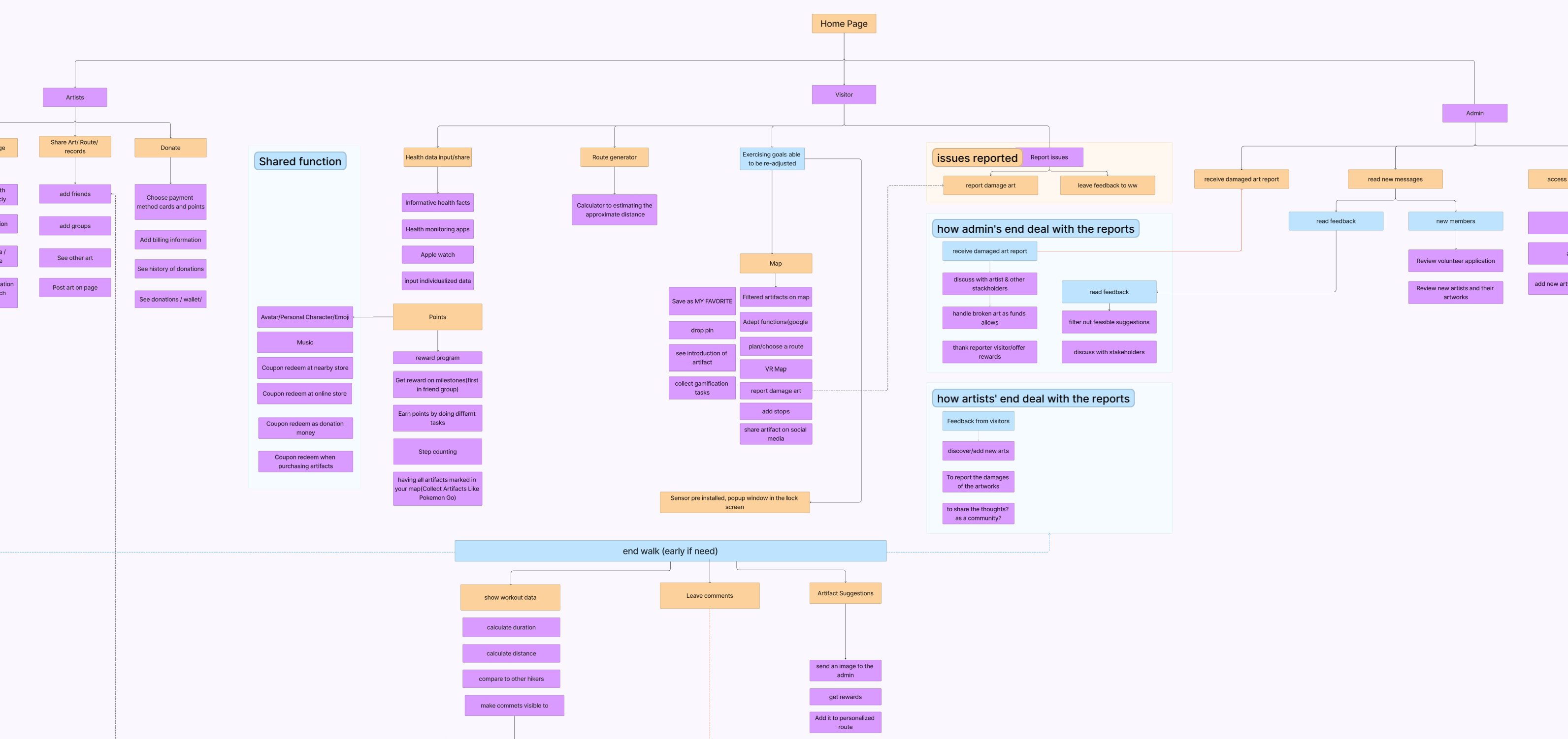
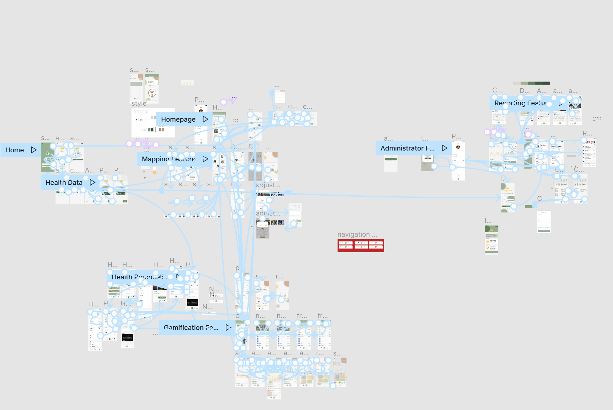
Research & Information Architecture
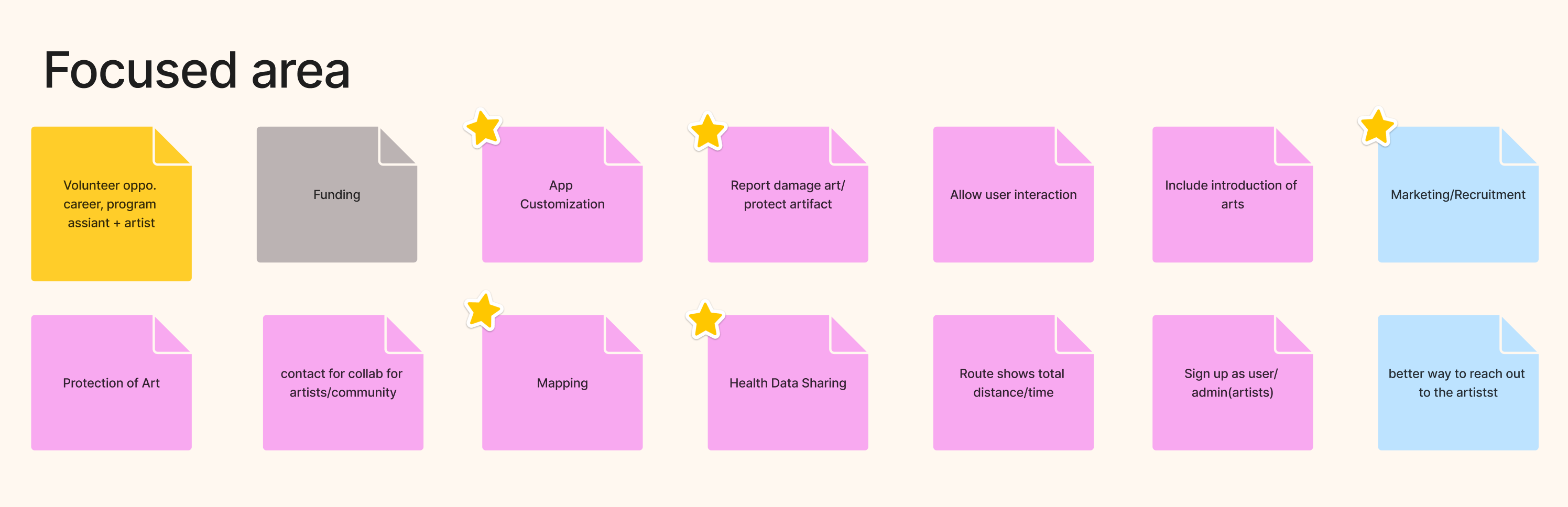
We synthesized our research findings into visual formats, organizing data from interviews and surveys, mapping out the full information architecture, and identifying priority focus areas for the app. Key areas included app customization, health data sharing, mapping, community collaboration, and marketing and recruitment.
Visualized Data
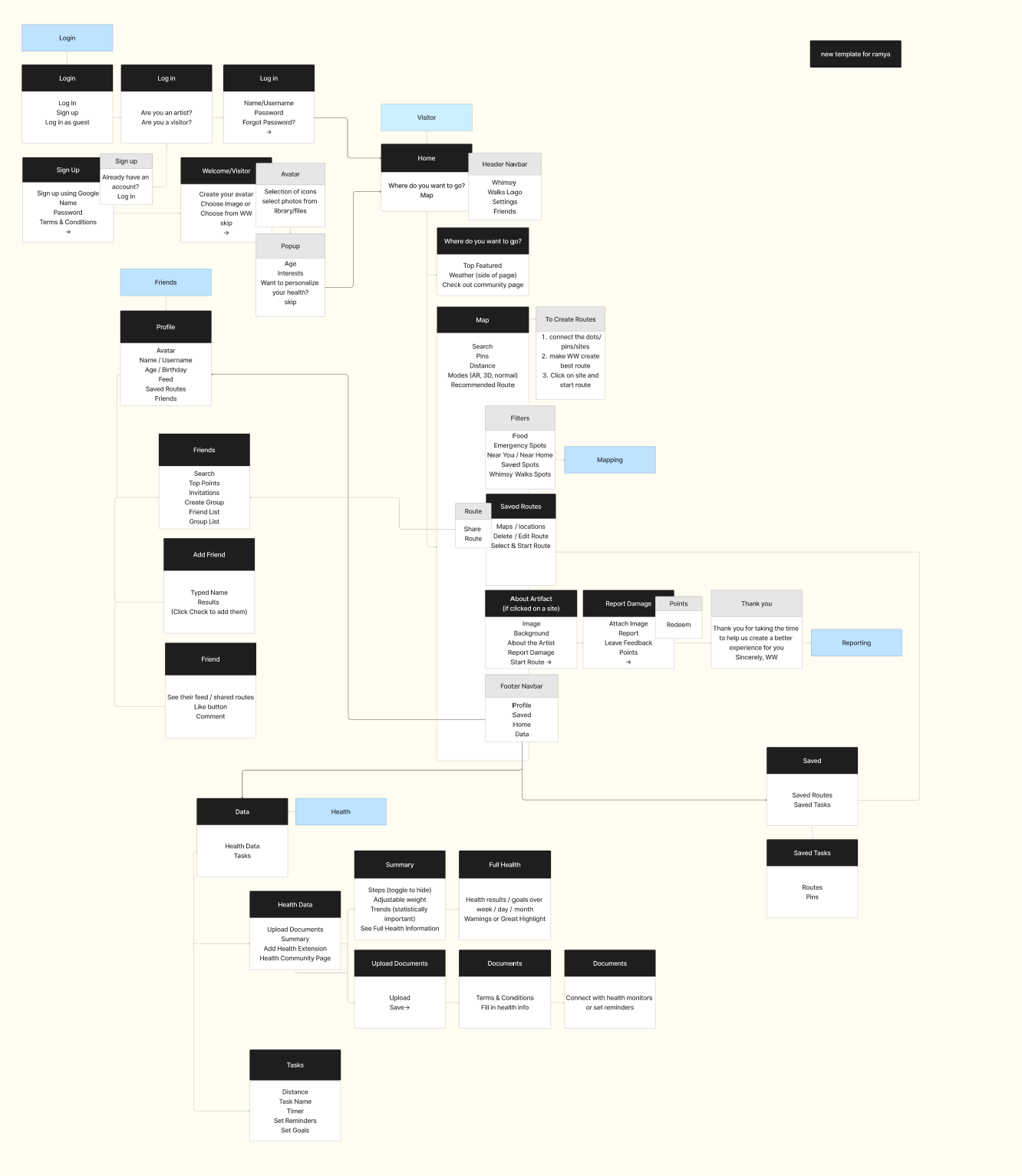
Using Figma, we translated our research into wireframes and user flows to guide the design direction.
Logo Ideation
A team member and I worked on the logo creations. Here are some of the original ideas and sketches that I worked on, both in Adobe Illustrator and on paper.
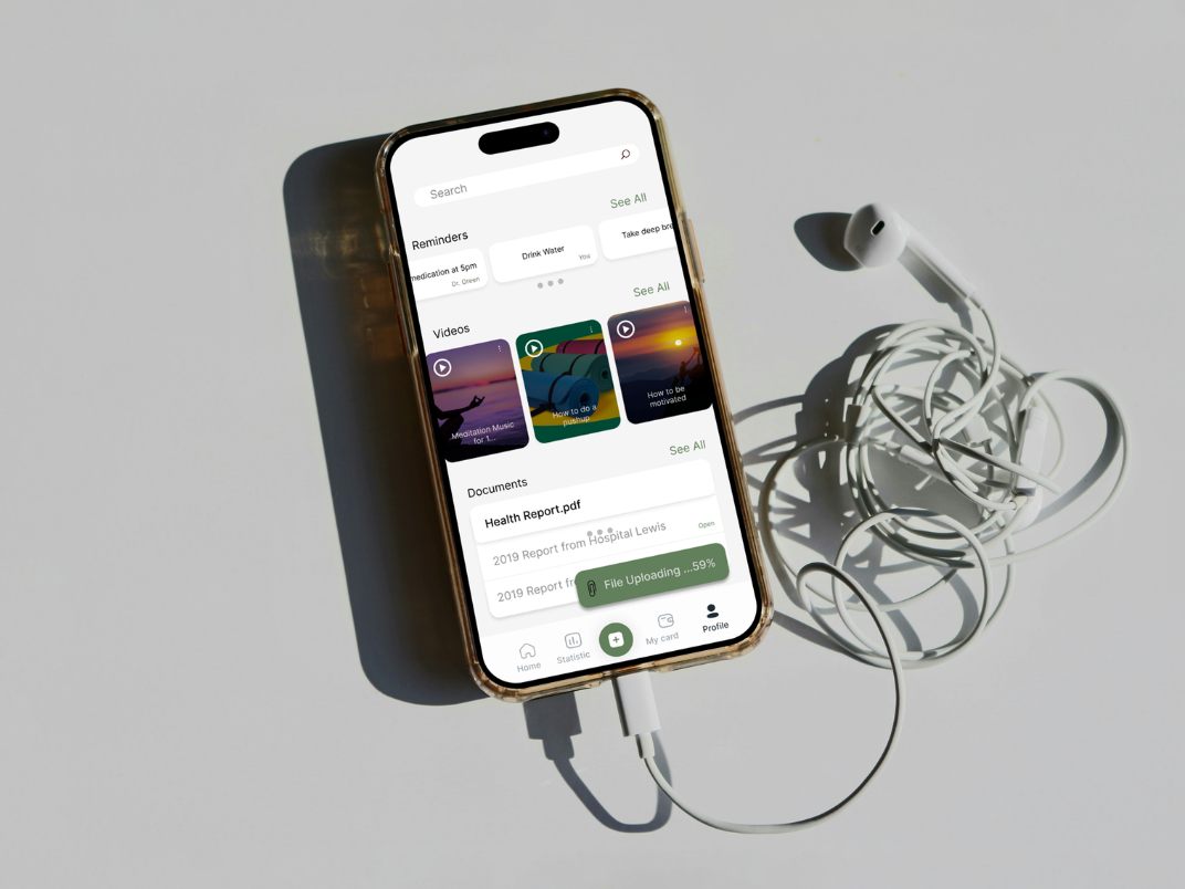
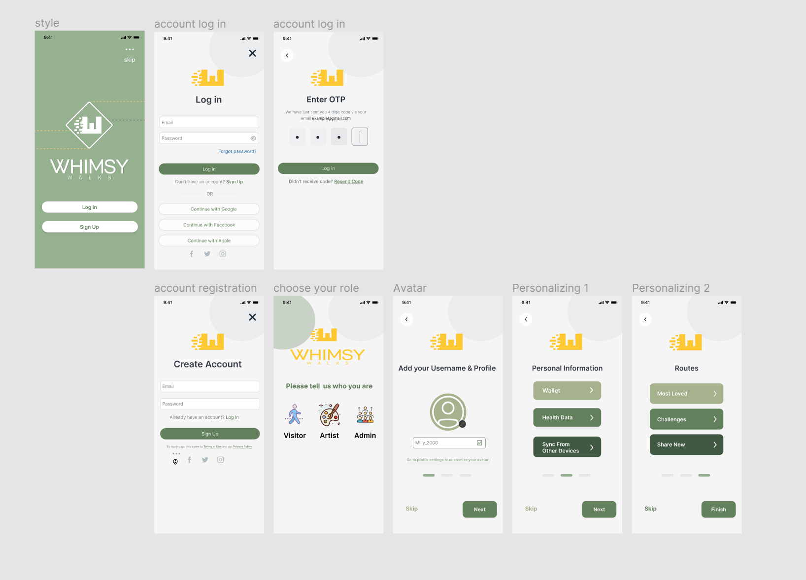
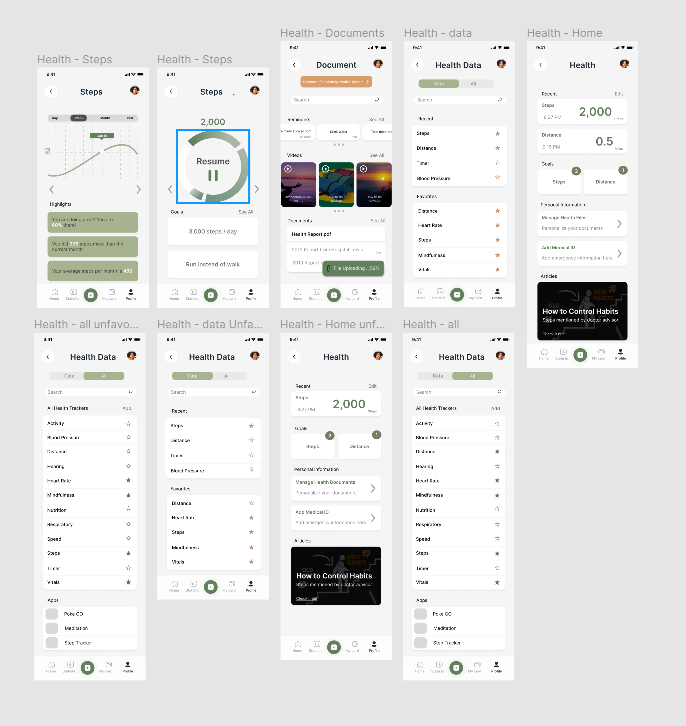
UI Design
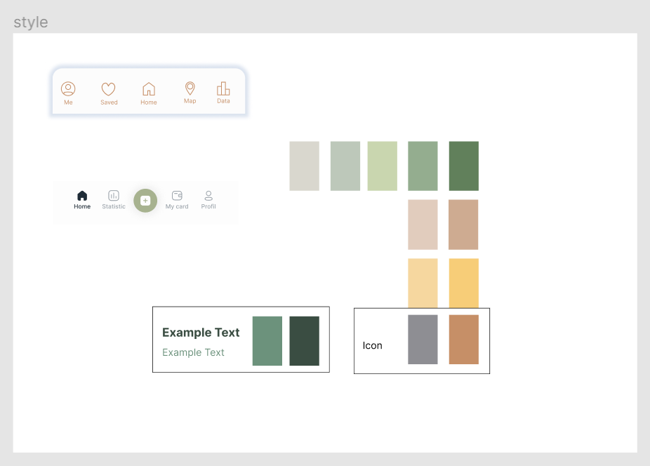
We established a visual language for the app including a nature-inspired color palette, icon set, and navigation patterns. The final screens include account onboarding, role selection, health tracking, and the full prototype flow connecting all features together.