Executive Summary
Xenon Arc is a distribution company that connects clients to their products and customers through a database called ConnTact.
Challenge
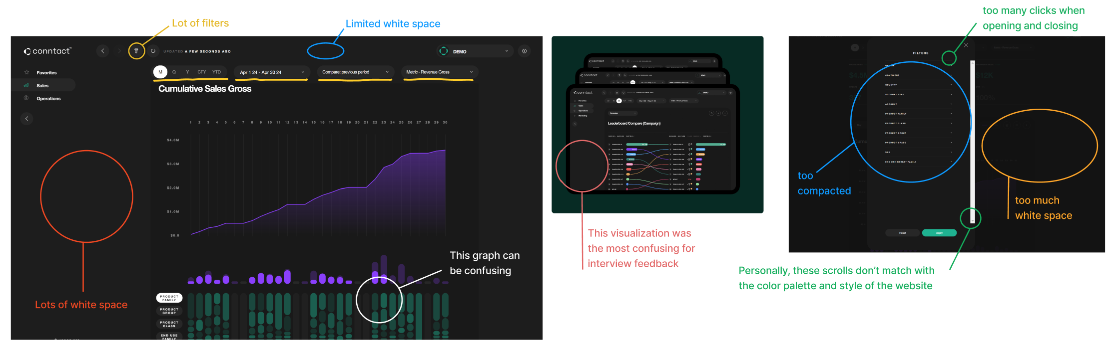
Zero client adoption of the ConnTact database due to confusing interface and poor information architecture.
Approach
User-centered redesign with 11 stakeholder interviews, iterative prototyping, and extensive usability testing.
Outcome
Redesigned dashboard with improved data visualization, intuitive navigation, and clear information hierarchy that users praised for clarity.
Problem Statement
None of Xenon Arc's clients used ConnTact because the information was confusing and the innovative visuals distracted from the data. Instead, clients relied on annual Excel reports prepared manually by Xenon Arc representatives.
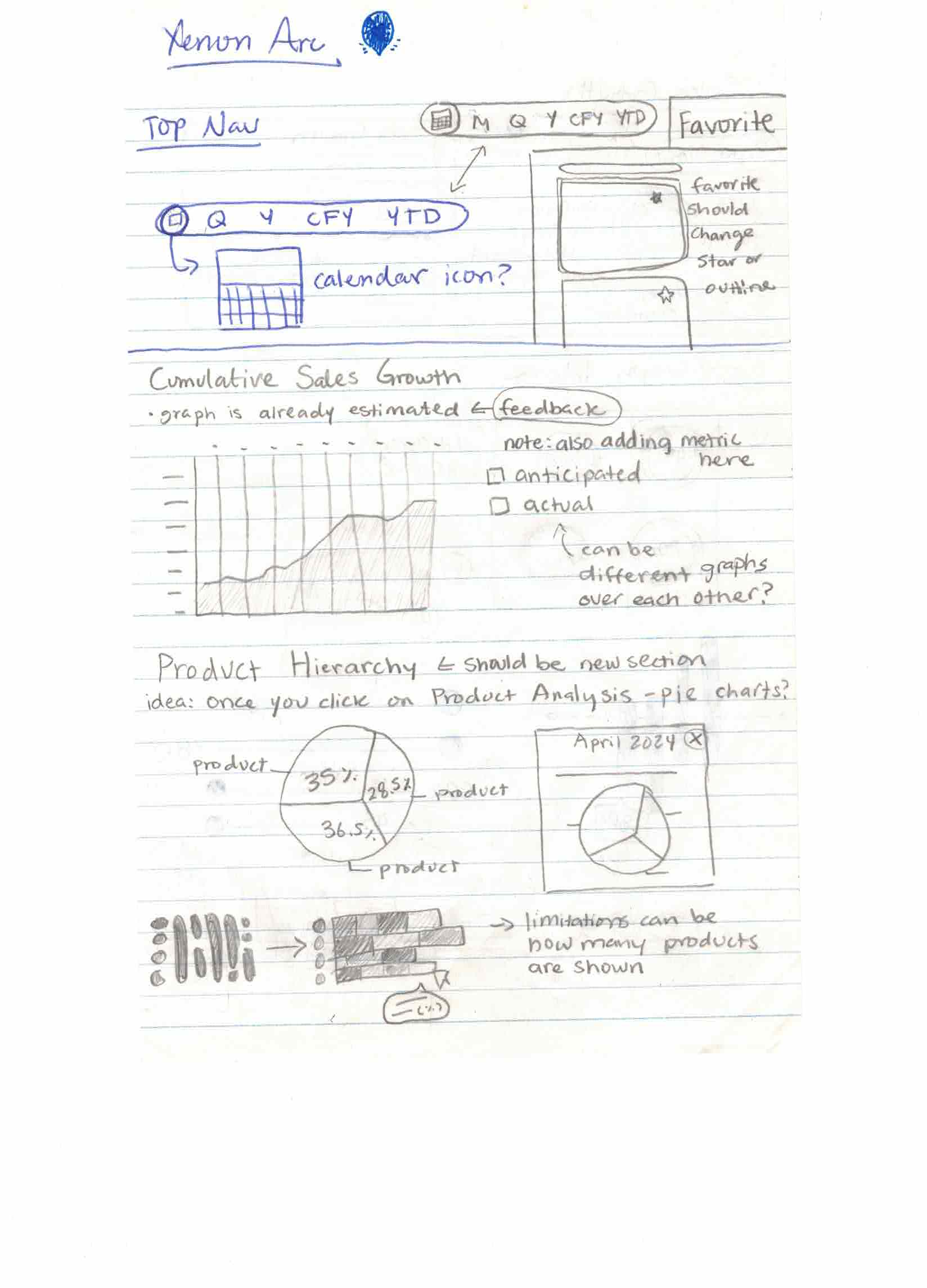
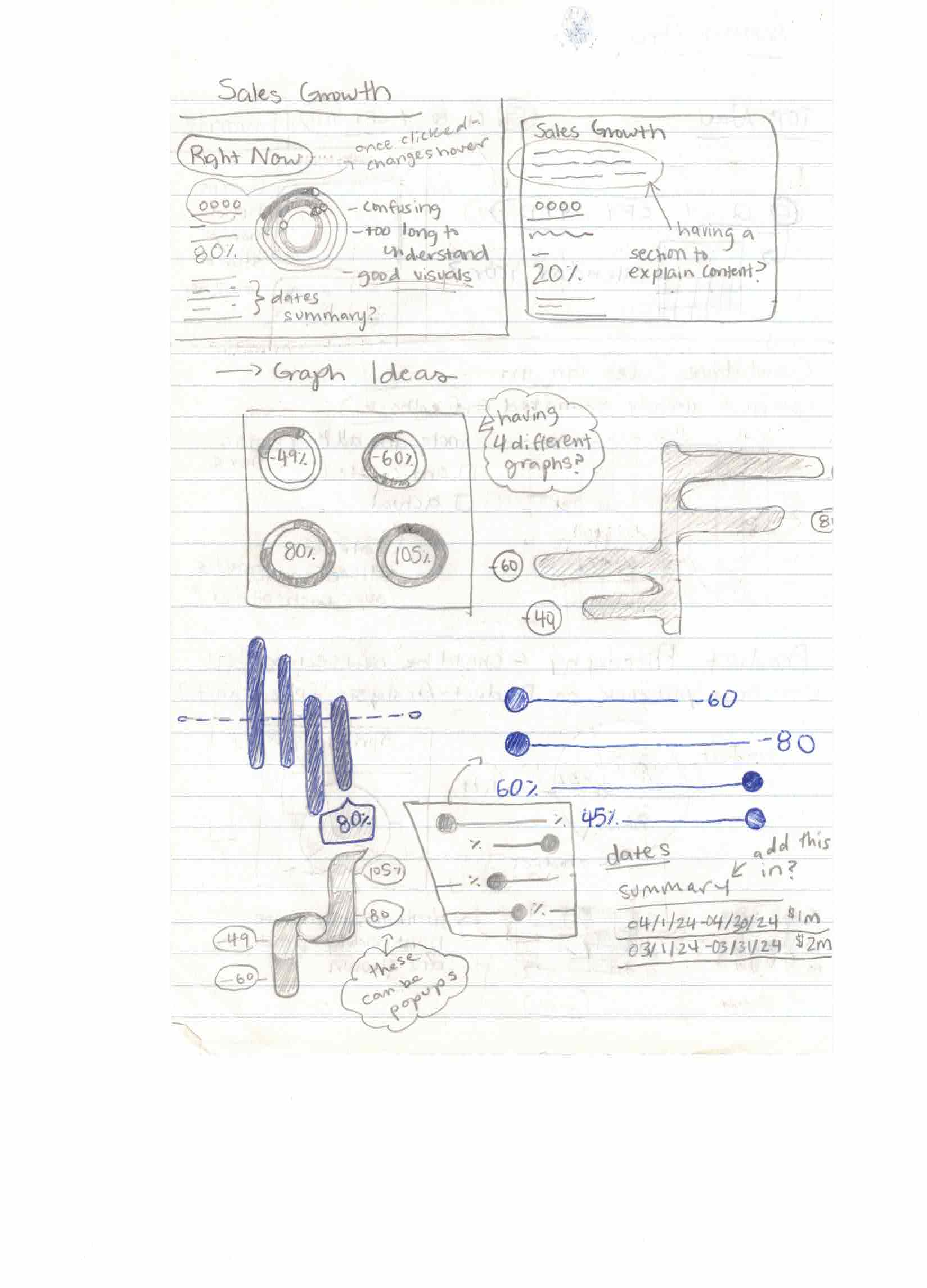
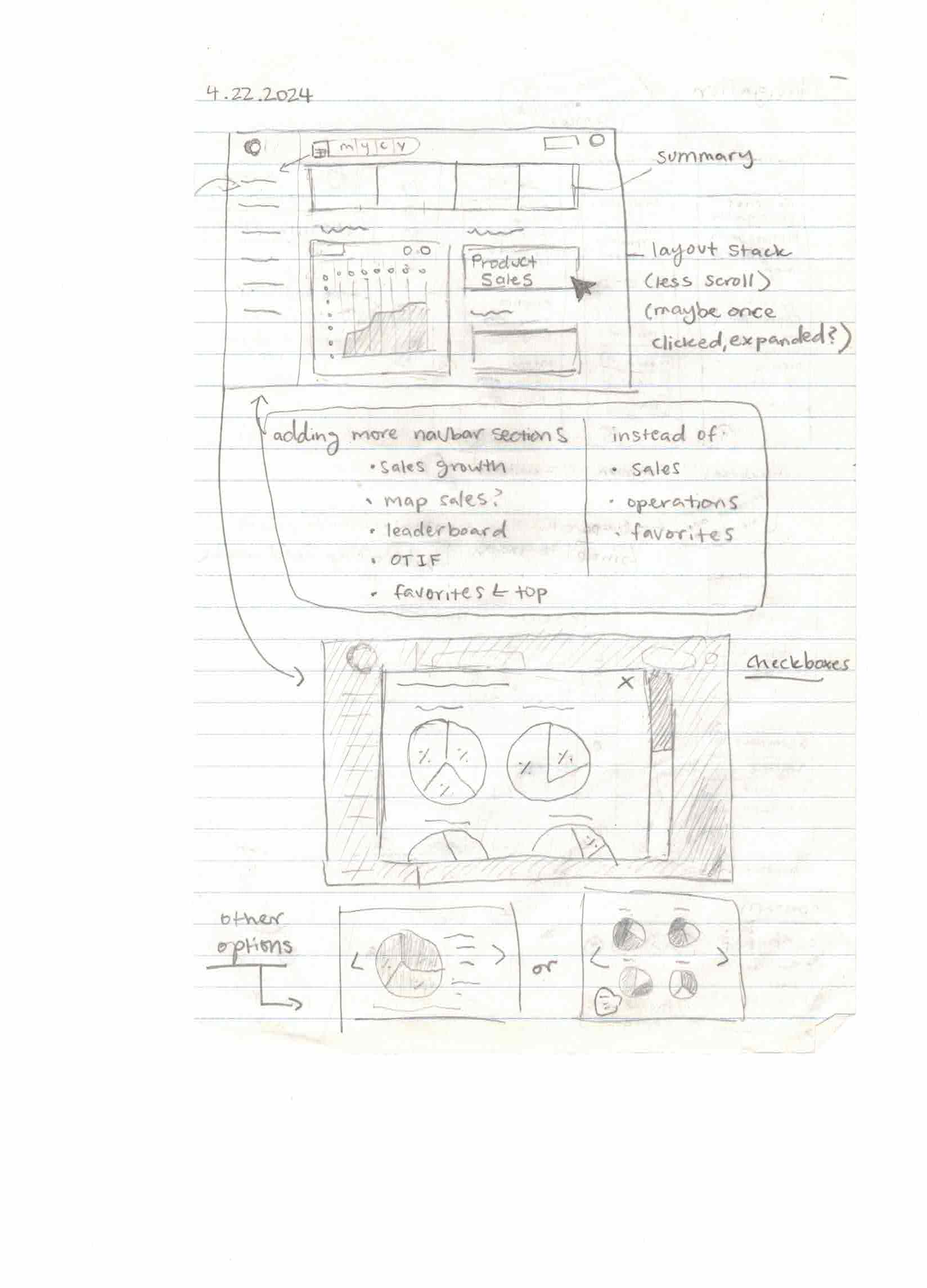
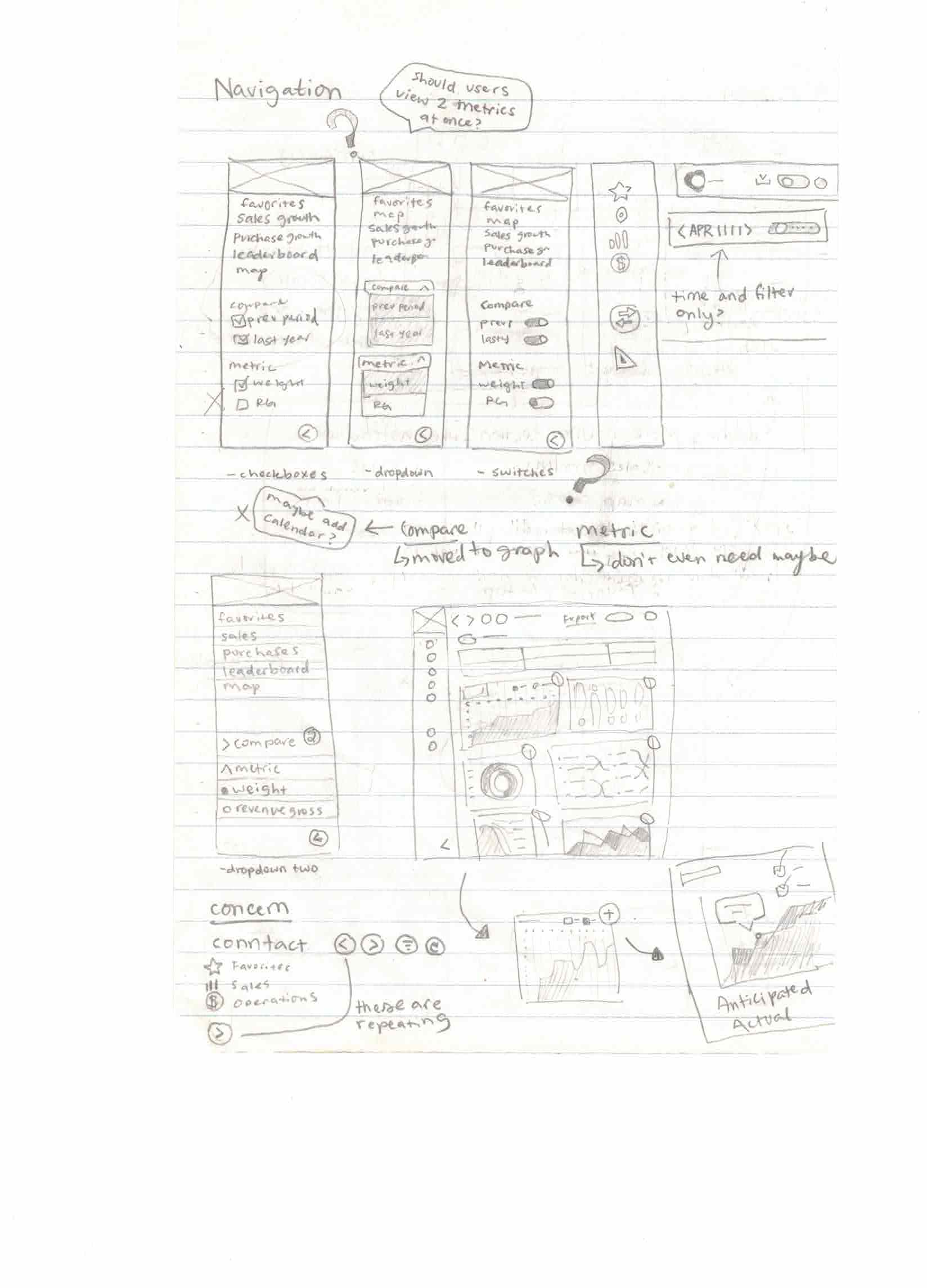
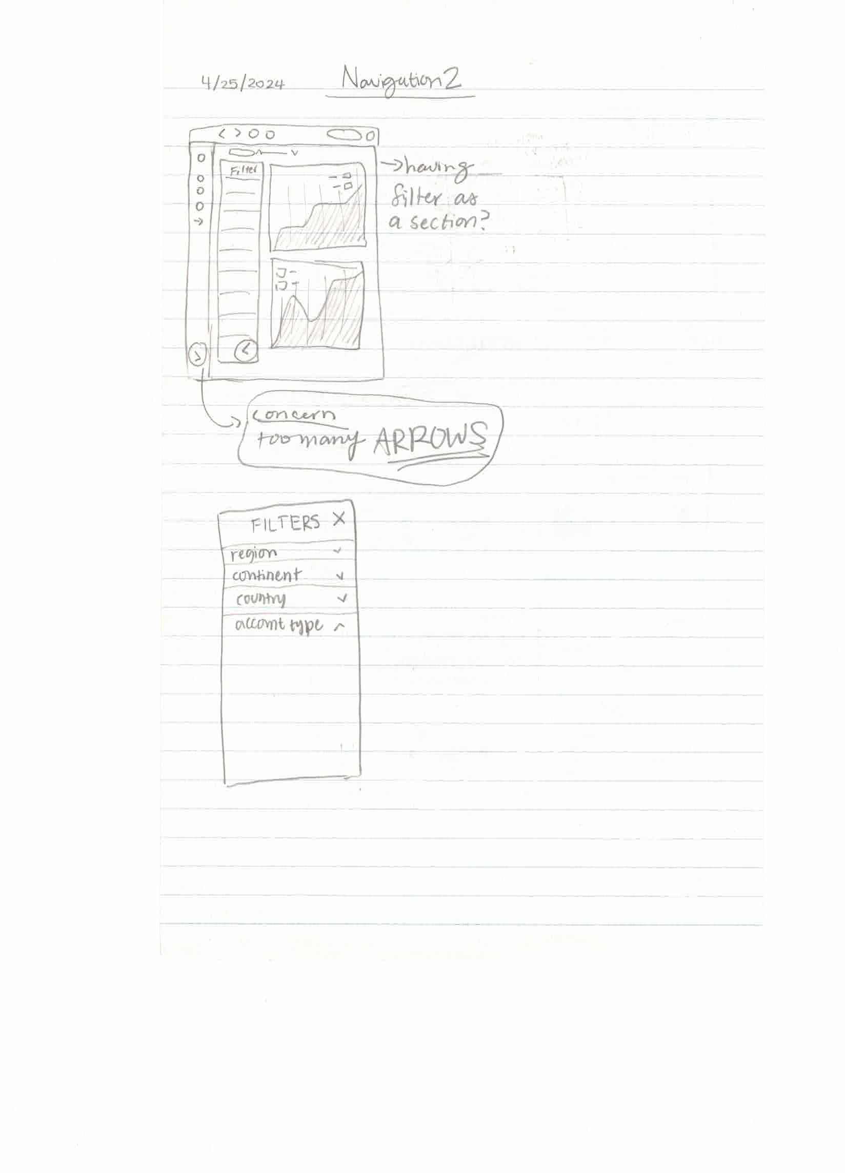
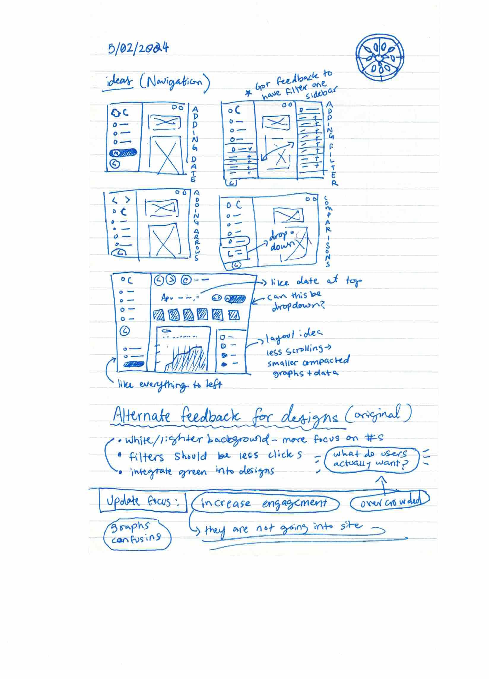
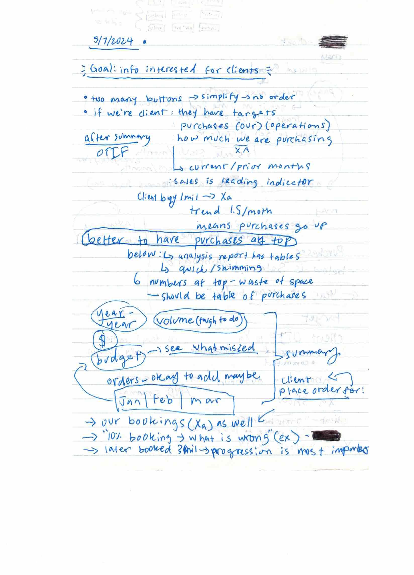
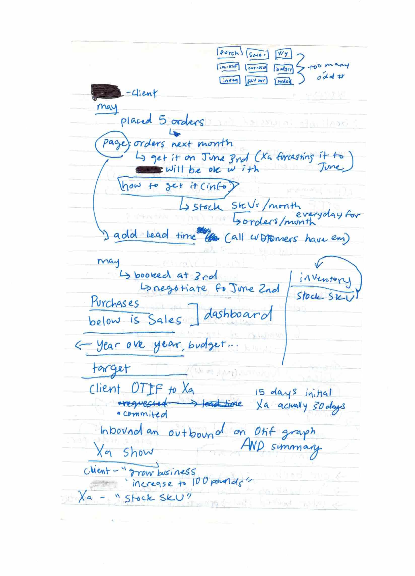
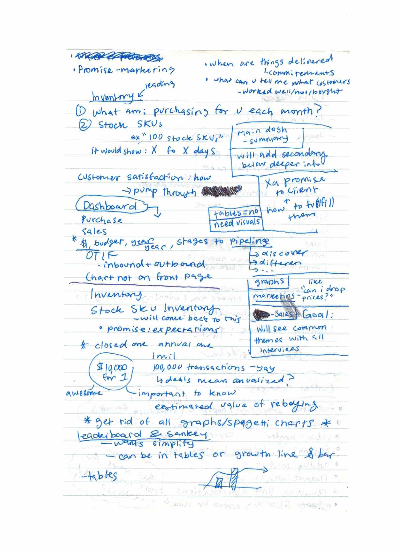
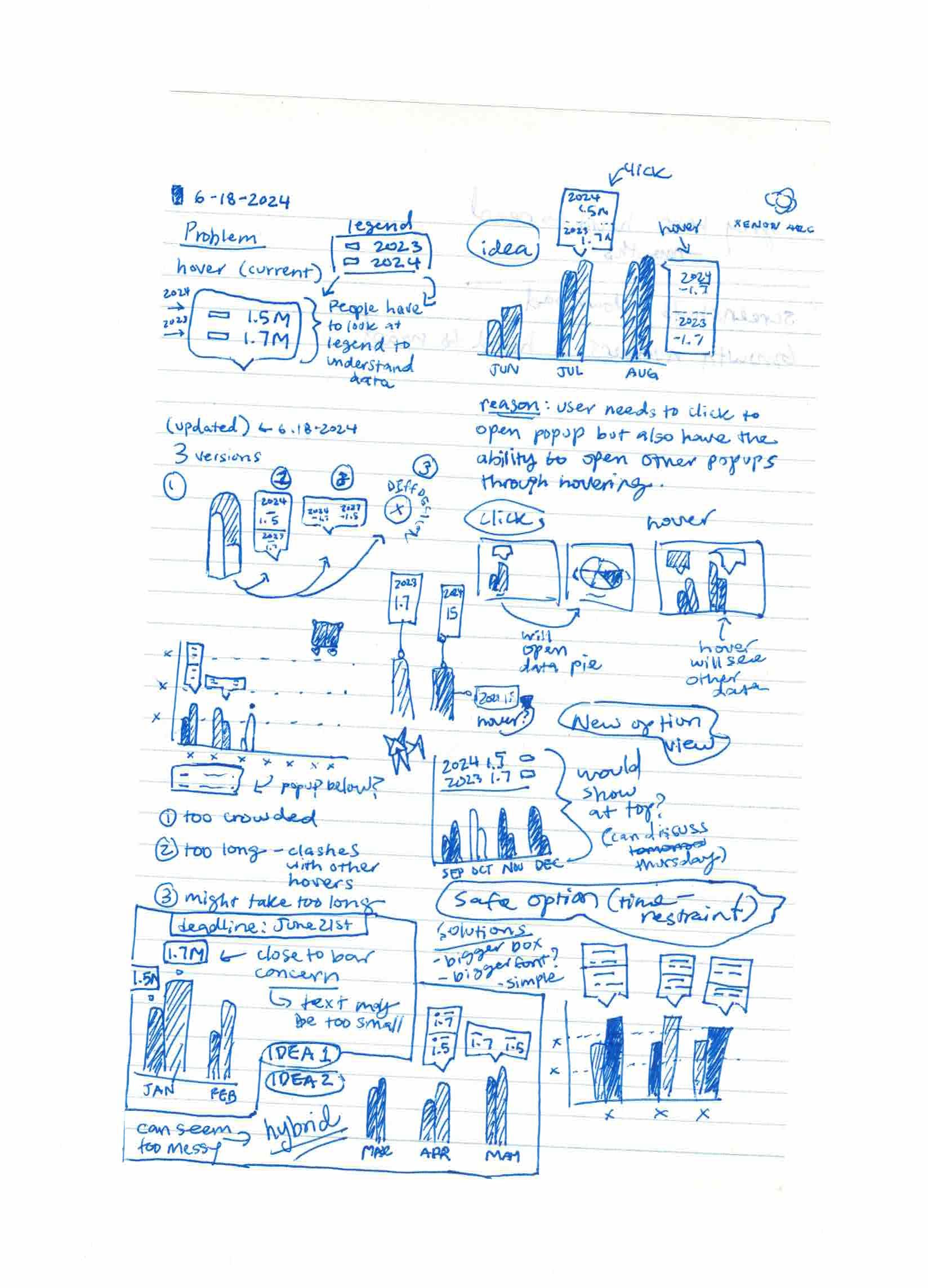
Design Evolution
Complete design progression from initial concepts to final implementation through iterative interviews and testing.
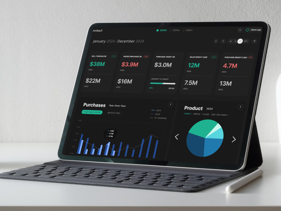
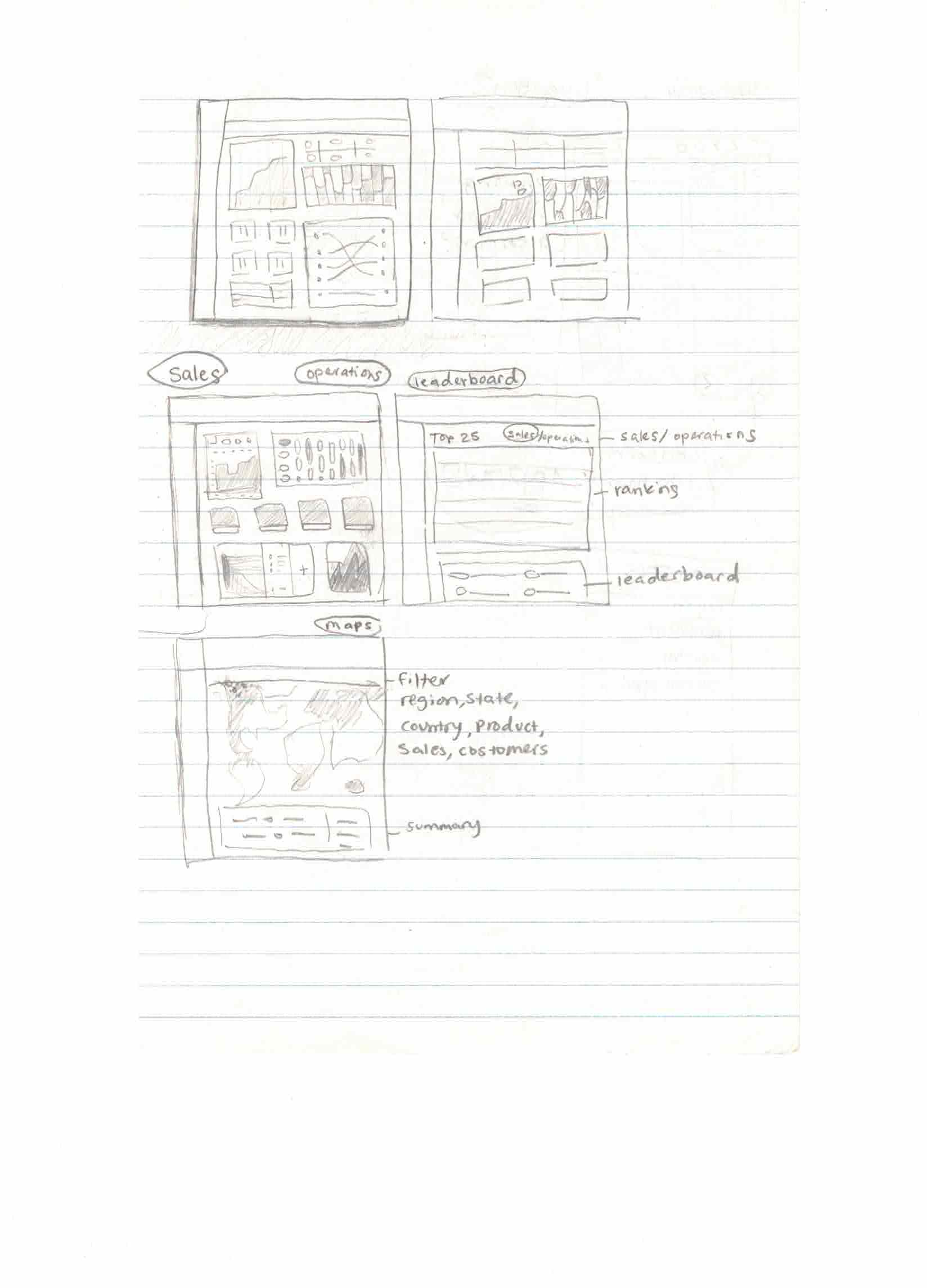
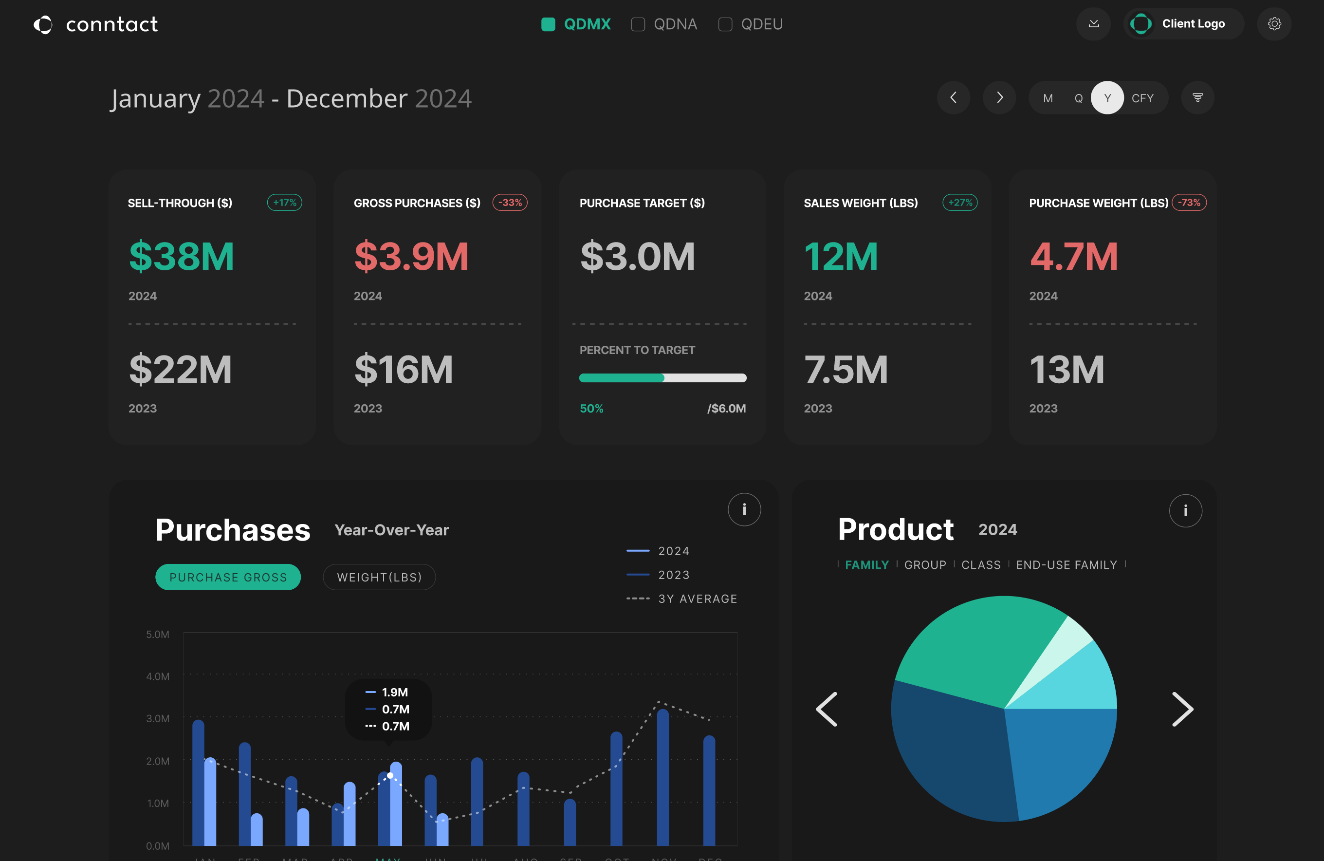
Analysis View
Comprehensive analysis dashboard showing data trends and insights.
Research
11
Participants (met each twice or more)
30-60 min
Interview duration
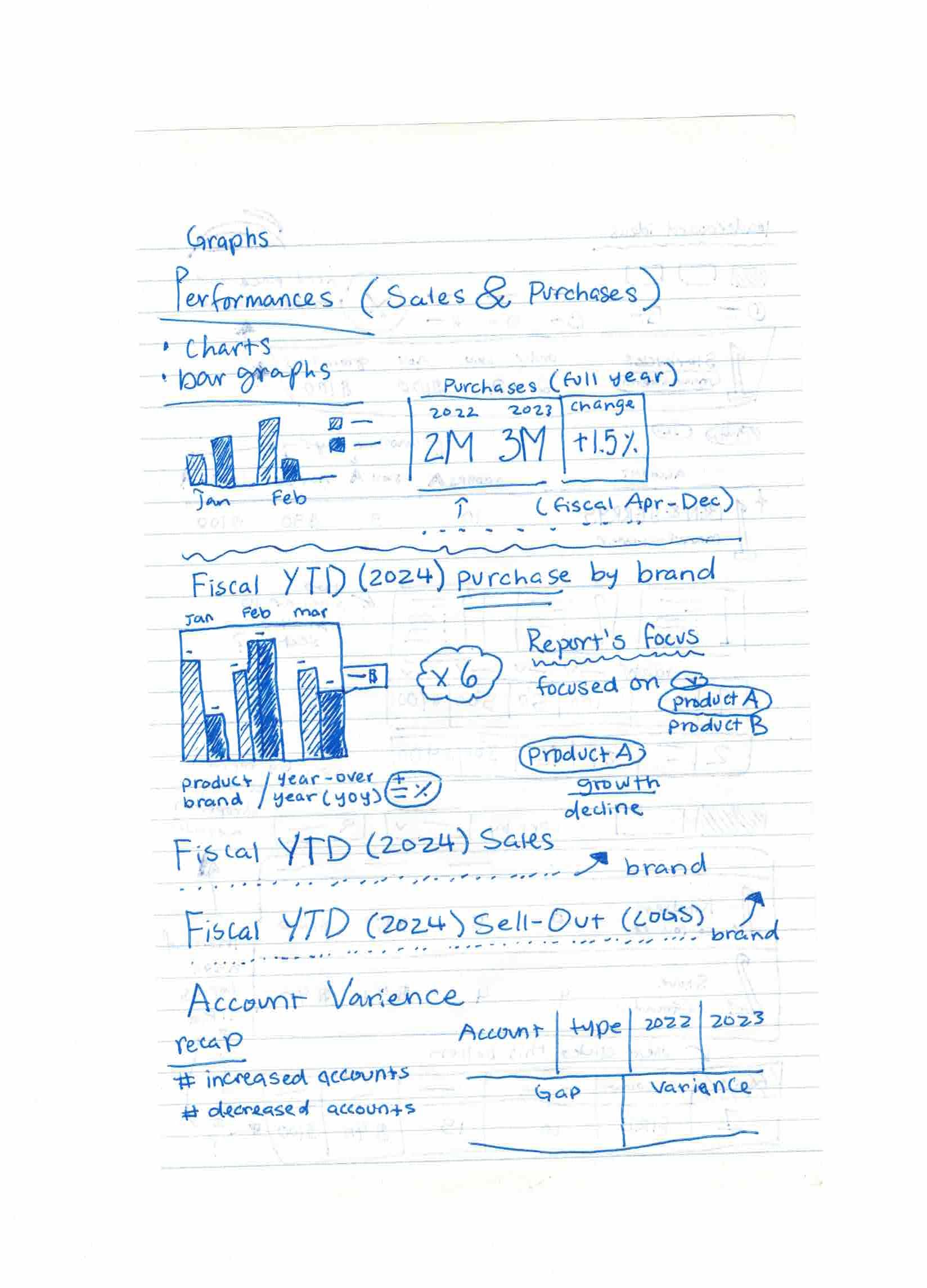
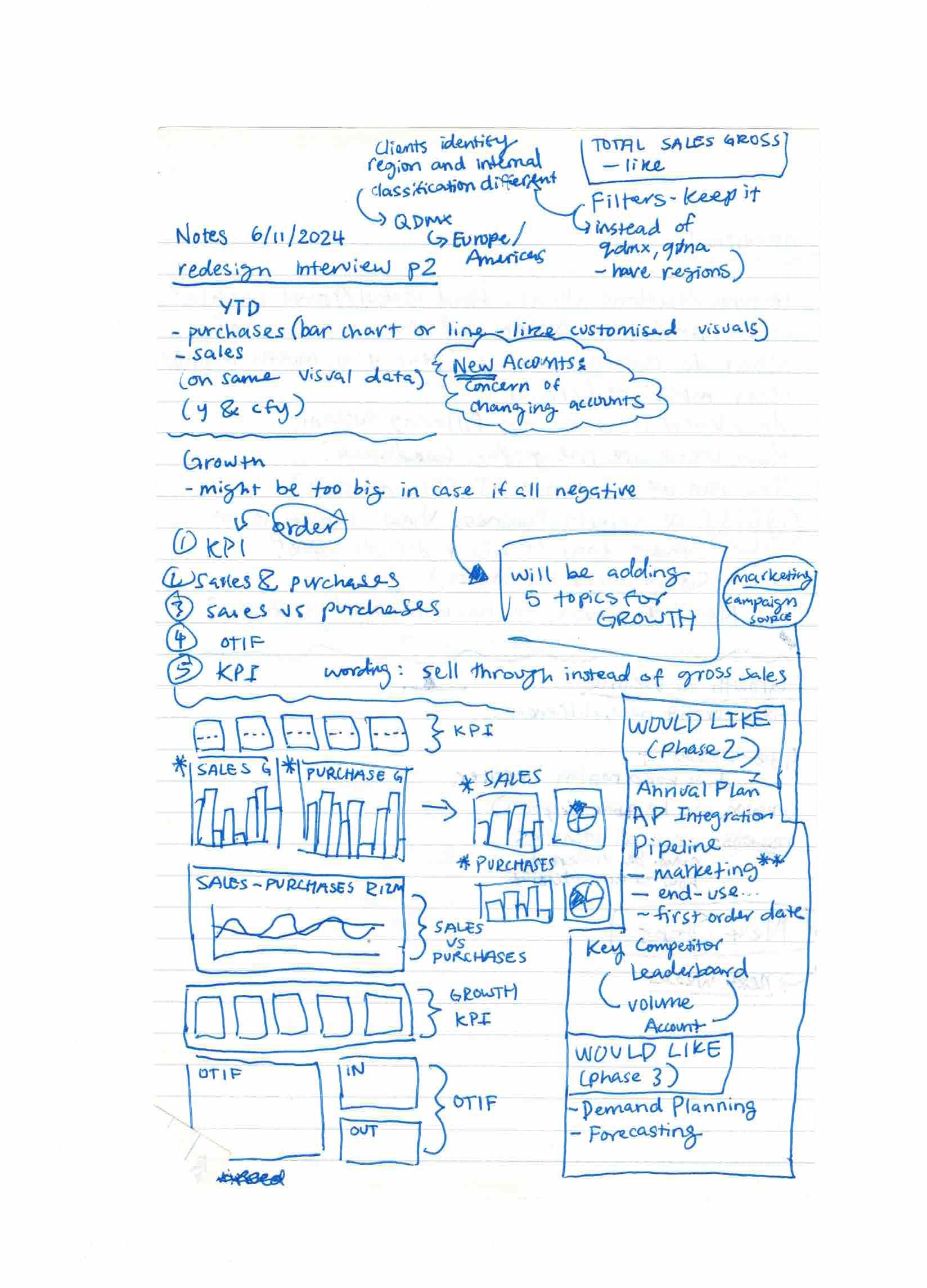
We interviewed finance members, client representatives, managers, and chiefs across multiple sessions. For each interview, I created a mockup or high-fidelity wireframe so participants could give feedback on both usability and visual identity.
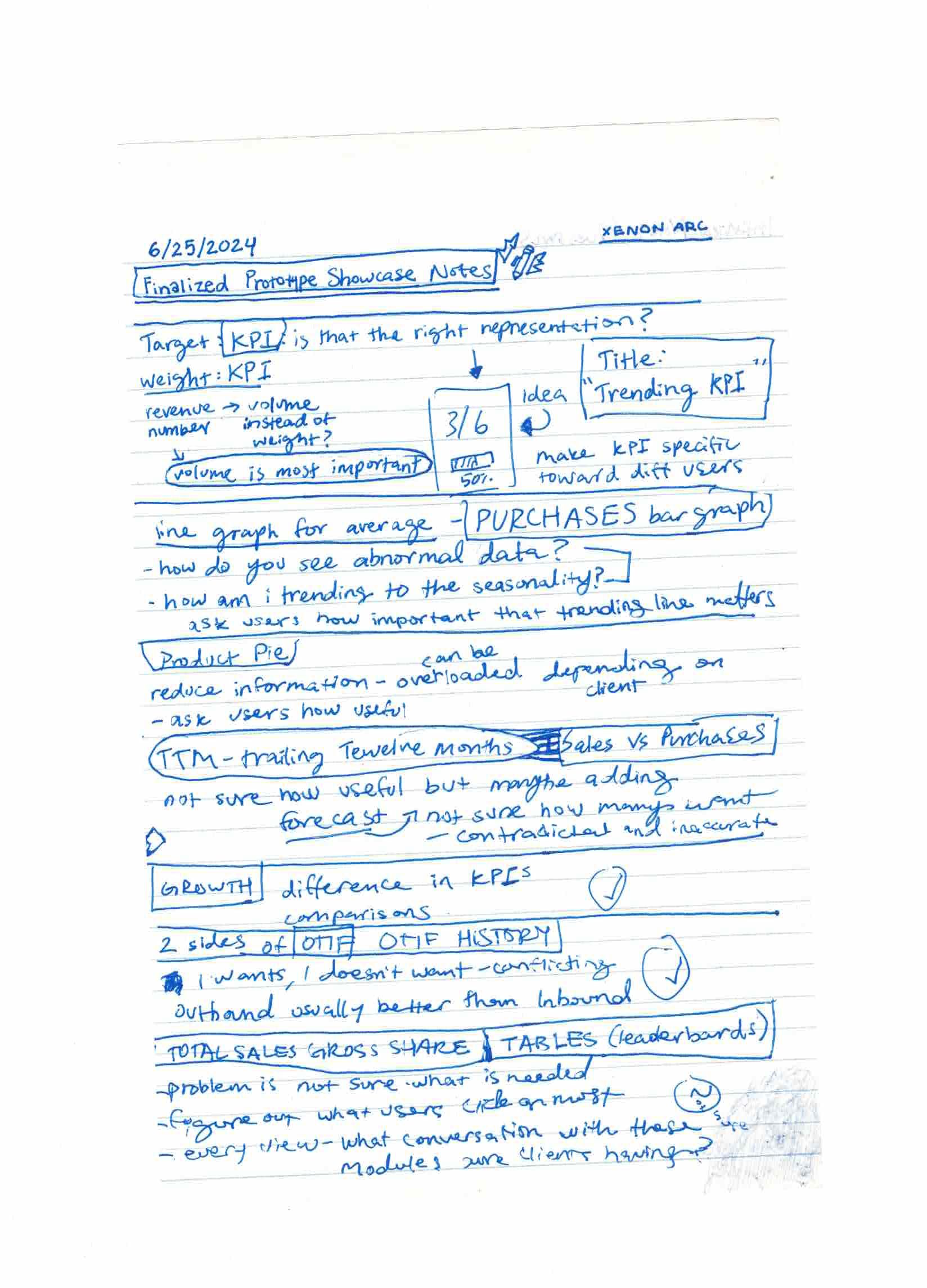
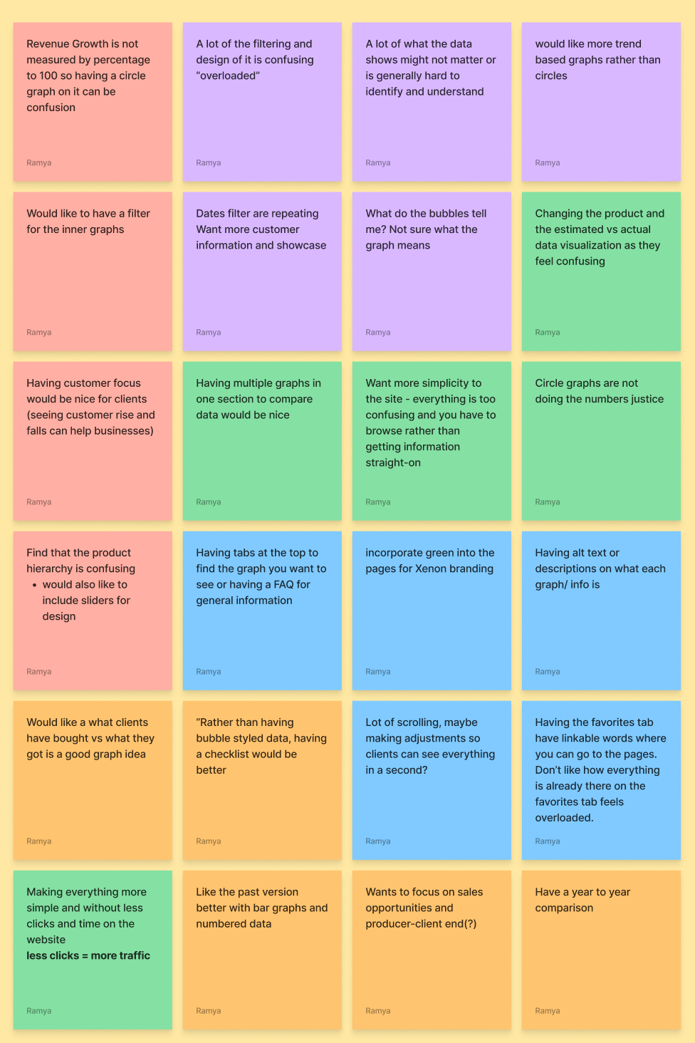
Key Findings
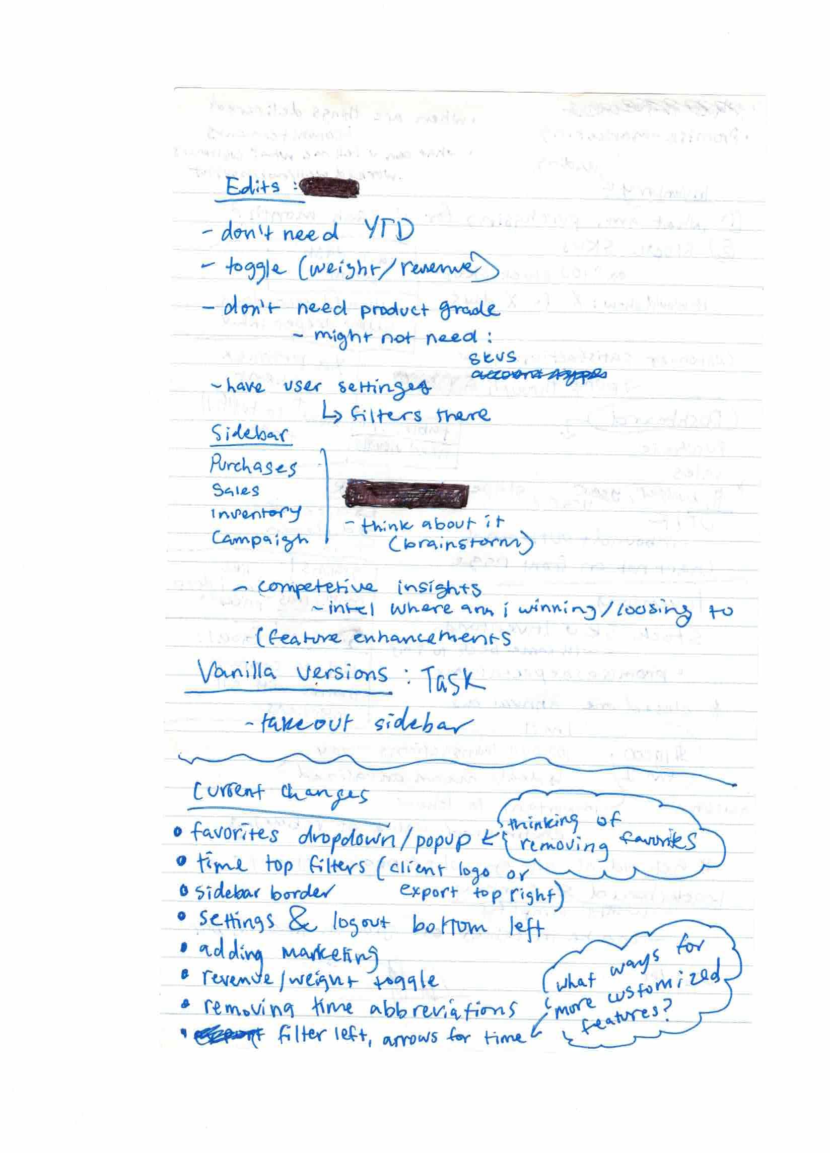
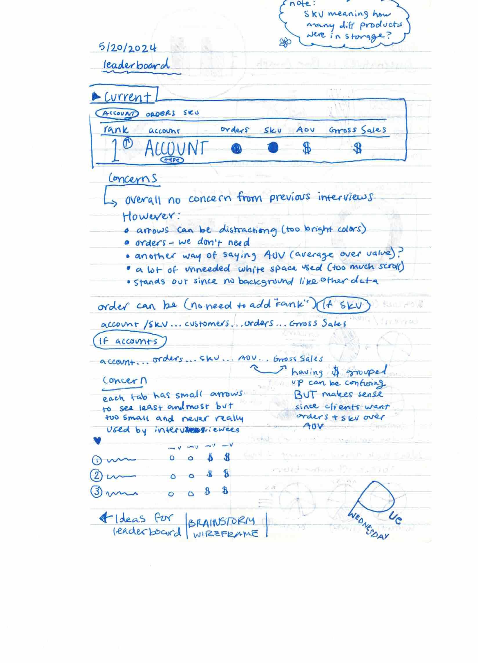
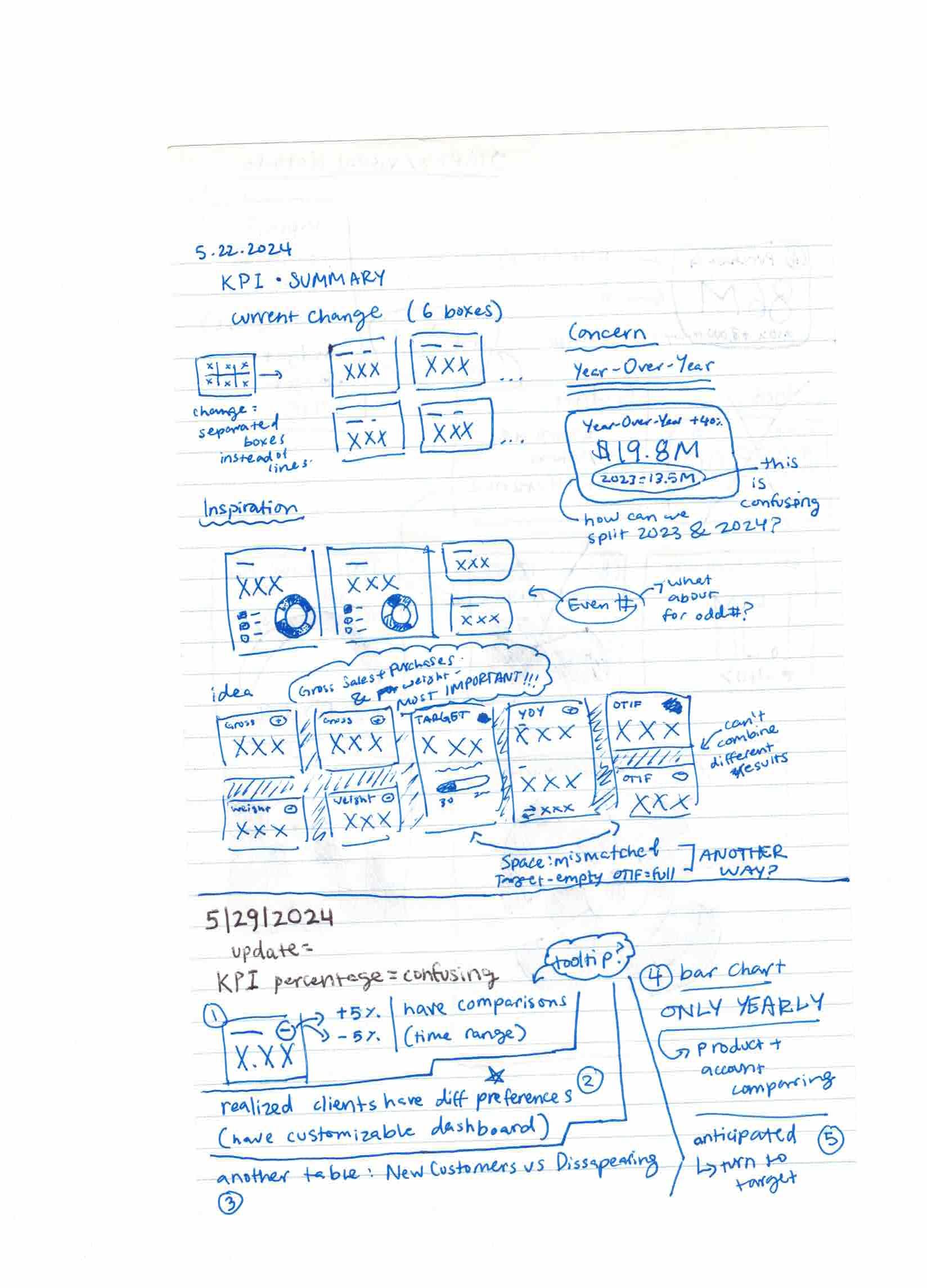
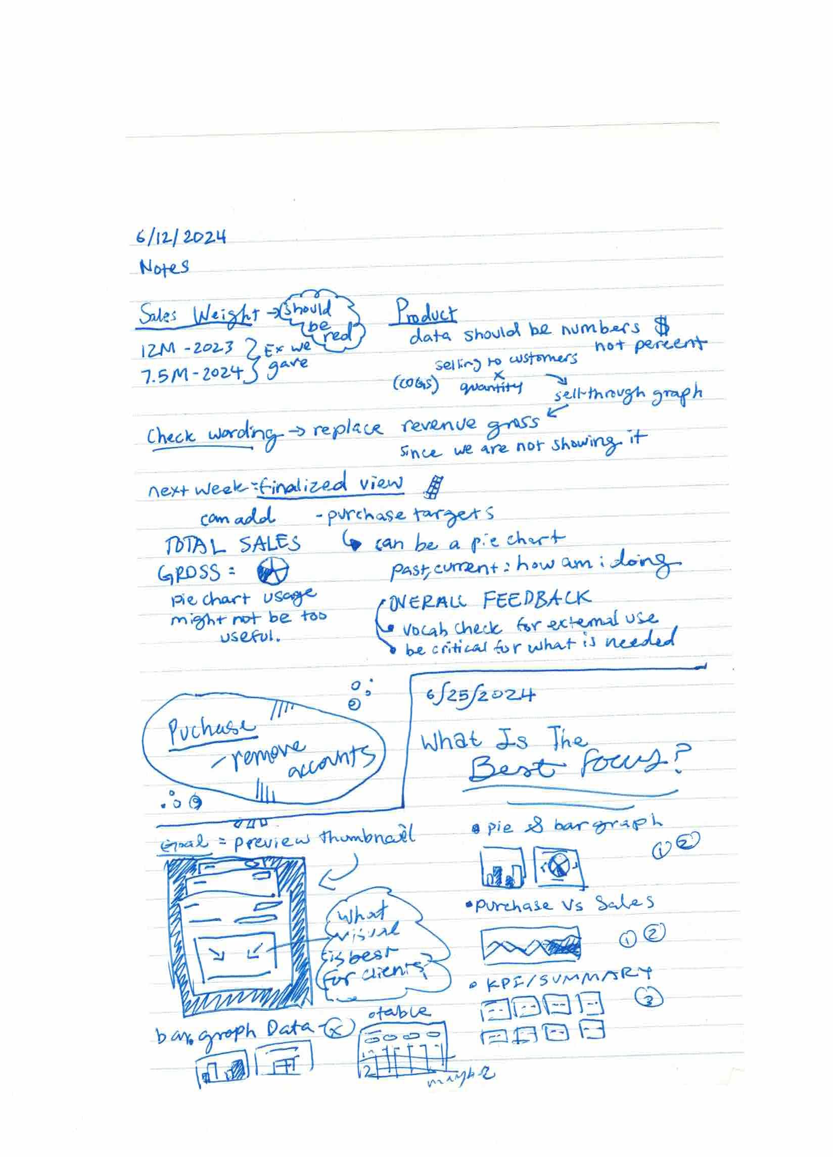
Obstacle: Conflicting opinions on what data ConnTact should display, plus the challenge of making the database self-sustained while participants wanted manually-updated real-time data.
Solution: We used participative design sessions with managers and client-facing team members, finding common ground on data that could be automated without human intervention.
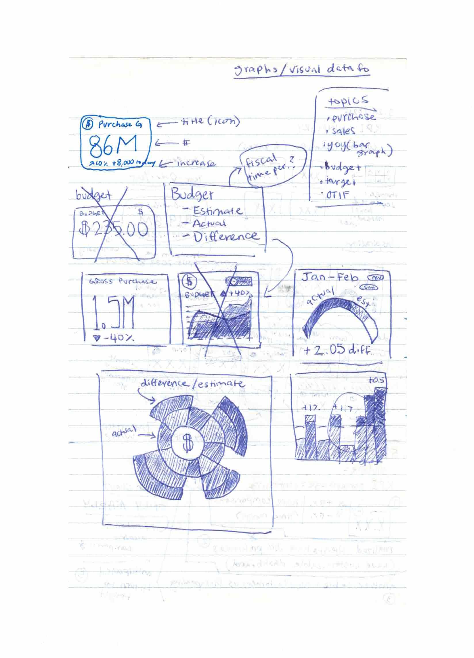
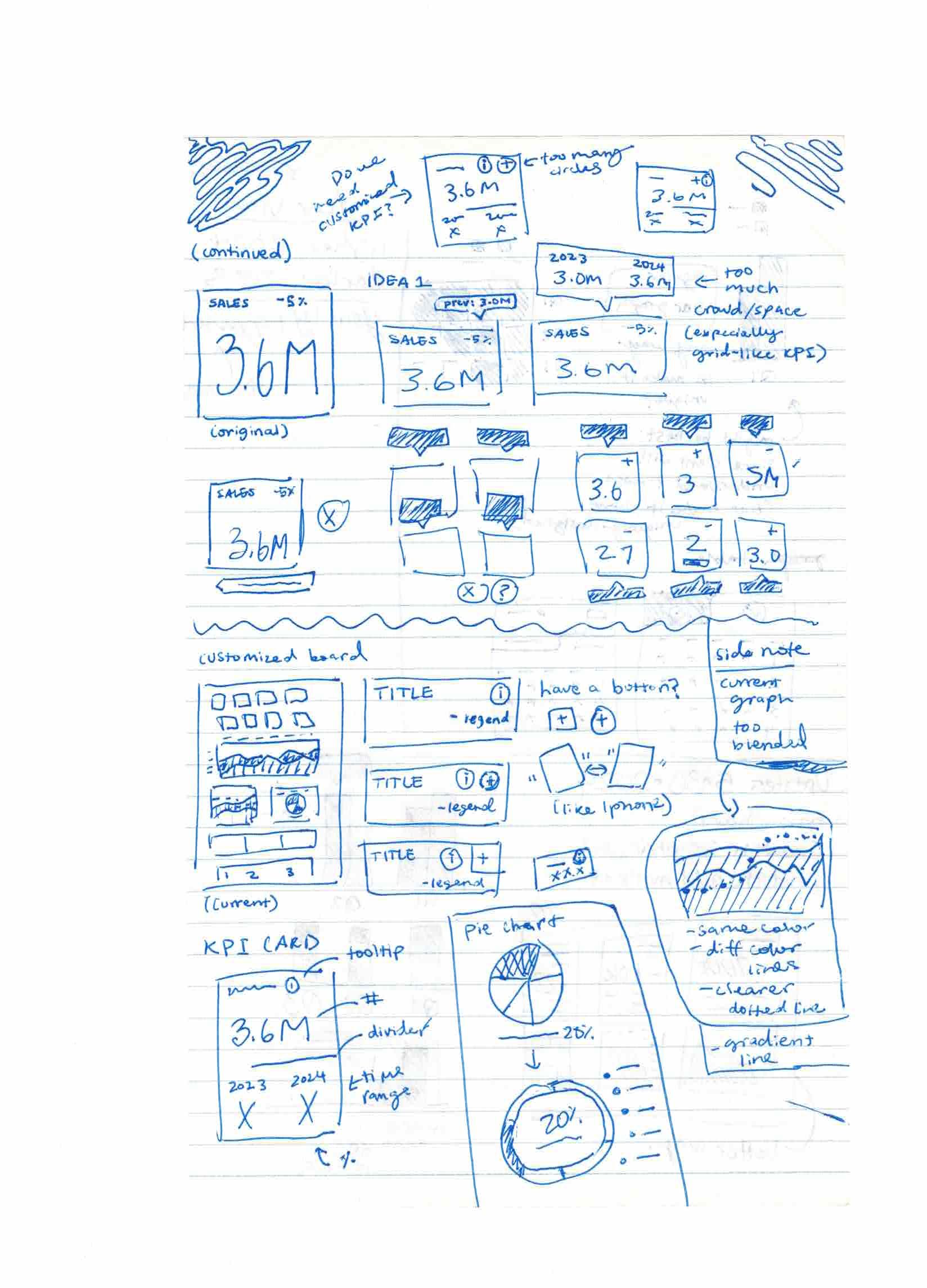
Visual Design
I chose lighter green tones over a white background based on developer feedback that dark themes highlight color over text. I also collaborated with a colorblind colleague to ensure accessible color choices across all chart types.
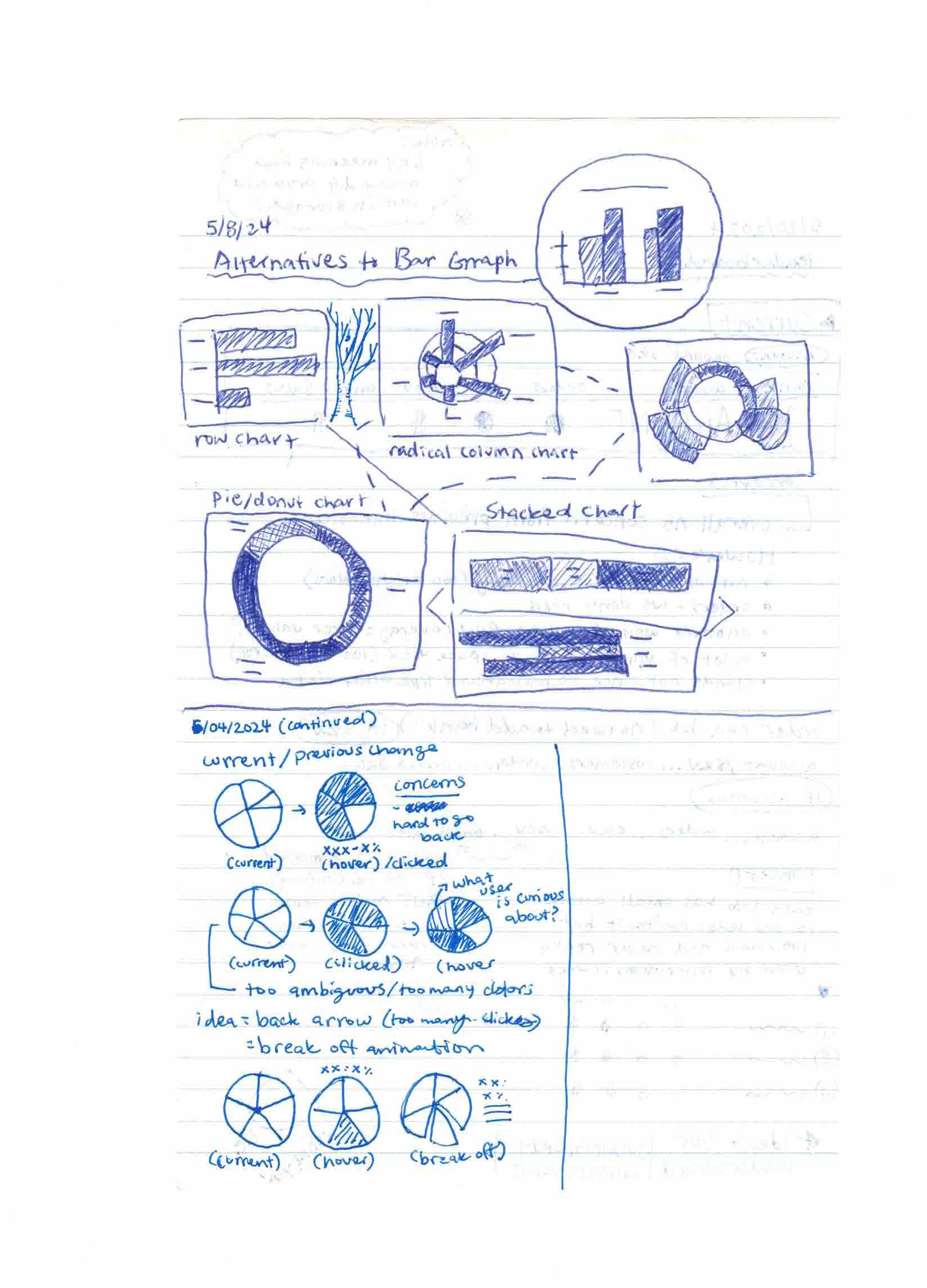
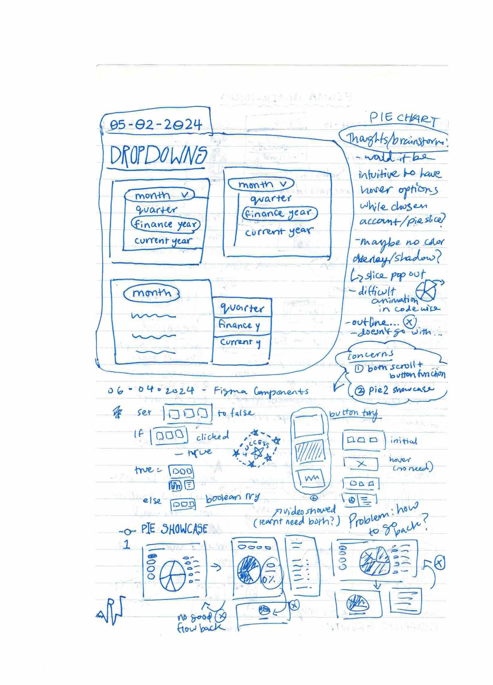
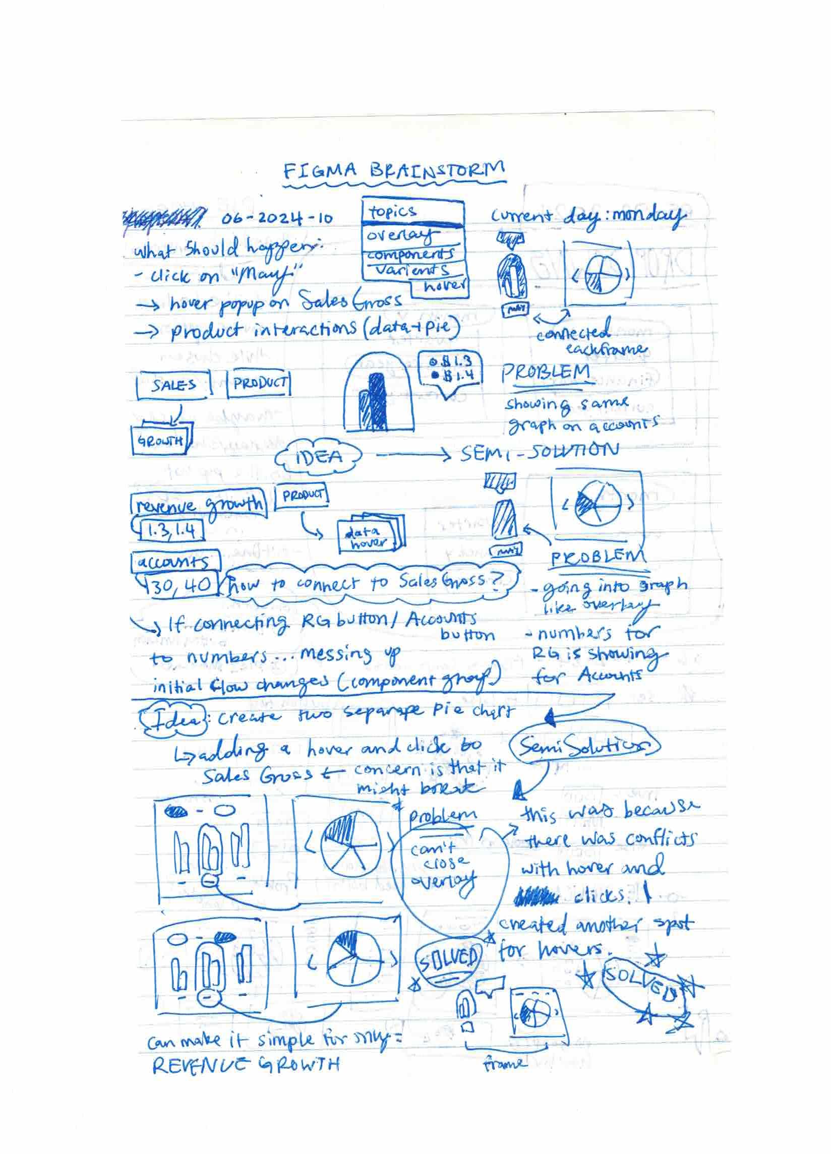
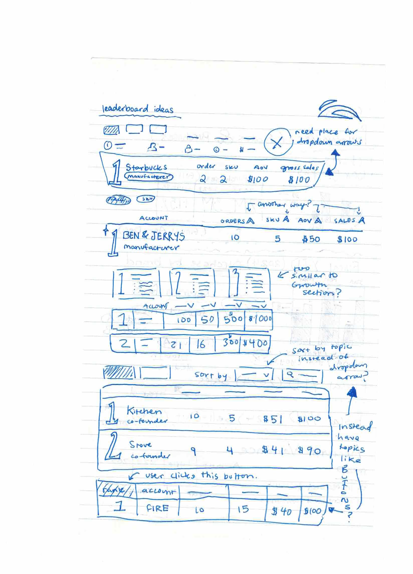
Data Visualization Iterations
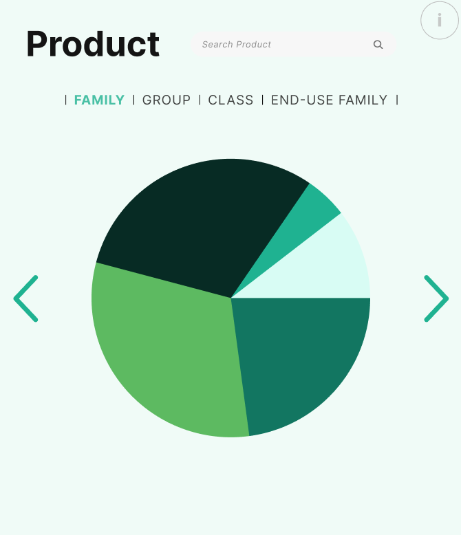
Pie Chart Iteration 2
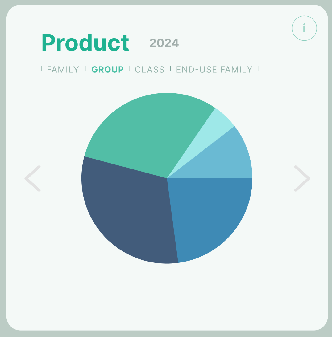
Pie Chart Iteration 3
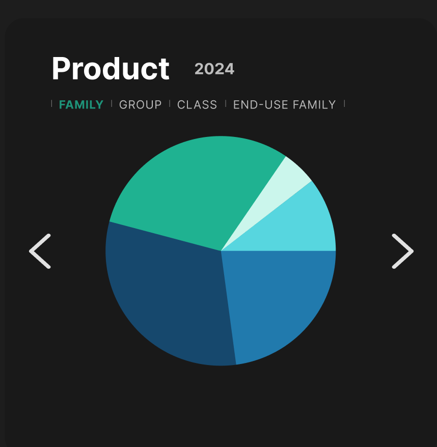
Pie Chart Iteration 4
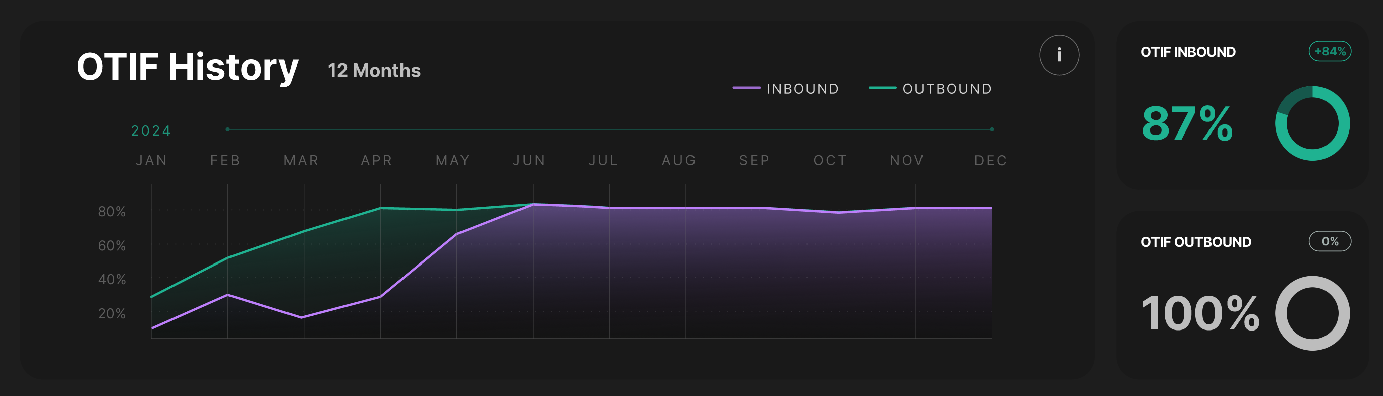
Line Graph Design
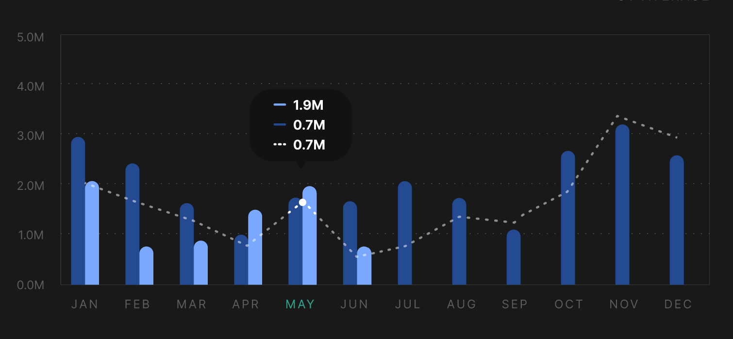
Bar Graph Component
Usability Testing & Outcome
I ran bi-weekly usability sessions with task-based testing (e.g., "find the filter button" or "locate OTIF History yearly"), where most users completed tasks within 10 seconds. By the end, participants praised the redesign for its clarity and liked the ability to filter and rearrange information.
All Figma Design Versions
Design files showing progression from May to July: